BLOG/WRITING
Colour My World

Few would doubt the visceral effects of colour and it was easy, when instructing, to use a sequence of images with vivid colour, an element of art, that would register an emotional human response much like a Voight-Kampff test. Sanguine livid red was an ideal choice.
From Kubrick's The Shining
From Coppola's The Conversation
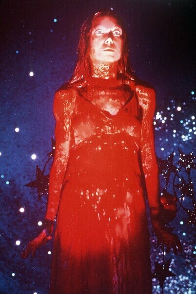
From De Palma's Carrie
Red seems to be one of the most provocative of colours if you present it in the right way. People can tend to 'oooh' and 'aaaah' over bright colours in a painting that have literally been just squeezed from a tube, an act requiring little or no discernment or ability.
Colour, strait out of the tube, is an easy way to get attention, and I'm always a bit suspicious that artists who use bright chromatically pure primary colours are hitting a lowest common denominator. I love Van Gogh's drawings and spent many many happy hours poring over them as an art student. I'm not so keen on his paintings. I might be wrong to be unmoved by his painting: I often told students that I like a lot of bad art and dislike a lot of good art for completely subjective and personal reasons. However, I could argue that it's the bright colours and a hundred years of public relations that have cemented Van Gogh's position in the art historical canon.
Use of colour can be nuanced and complex, particularly in decoration and decorative art. I certainly took colour seriously when younger and painting for a living. But decoration wasn't generally what I had in mind when I thought of the kind of art I'm drawn to, hence my bias against 'decorative', pretty or overtly pleasing pictures. I was often obliged to use livid and primary and secondary colours in animation work. But generally I've been more interested in what is inside of the colour wheel, all the taupes and cool greys effected by colour. These are the dirty colours that emerge from mixing primary and complimentary colour. These are wonderful colours to model form with.
In the extreme through, as a result of my love of drawing, I'm even more interested in the absence of colour. I see a red door and I want it painted black.
Komar and Melamid are a couple of Soviet-era emigres to the US who did a survey which would allow them to patch together 'The Most Wanted Painting'. They asked for favorite genre, subject matter and contents, and which colours were preferred. The end results were fairly similar in various countries; in the US landscape was preferred with averaged out proportions of sky, land, water, grassland, trees, high ground, and lowlands, animals and a historical figure.
Do bear in mind that really, the whole project is almost certainly a conceptual joke and isn't really meant to be taken very seriously. The idea of crunching data on taste into a representative painting can be done but the results are absurd. It's quite possible that Komar and Melamid are mocking art, surveys, not to mention ordinary people and their tastes. Here are the survey results for favorite colours.
Blue: 44%
Green: 12%
Red: 11%
Black: 4%
Purple/Violet: 4%
Brown: 3%
Pink/rose: 3%
Beige/Tan: 2%
White: 2%
Grey: 2%
Yellow: 2%
Mauve: 2%
Fushia: 2%
Maroon: 2%
Let's go back to 'seeing red', because it's such a provocative colour and can provide us with a powerful example of the impact of colour as an element of art, particularly when designed to do so, by nature or by humans. Red in nature and in human social life might be a way of signalling. Although a red stop sign or fire engine can signal danger, and certainly catches the eye, often red seems to be used for signalling for reproductive purposes.
Find the opening portal for The World's Most Wanted Painting HERE.
Red catches the eye of insects and hummingbirds seeking nectar in a feeding/fertilizing relationship between flora and fauna.
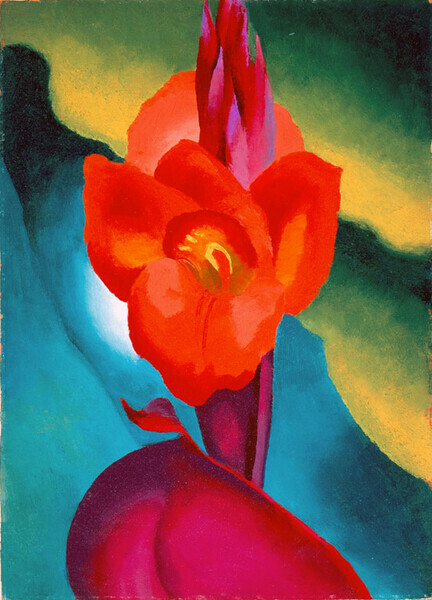
Above, Georgia O'Keef's paintings of flowers (and mimics of them) often appear like female sexual organs and O'Keef often deploys red.
Below, lipstick catches the attention and turns the mouth into something lividly sphincter-like which is generally considered an exciting form of sexual signalling.


In some species of primate females display anogenital tumescence during estrus, which is likely a kind of signaling of sexual fertility and receptivity for males. Reds, or pinks, seems the signalling colour. There's something of an analogue in the art historical record where artists wish to bring attention to sexuality.
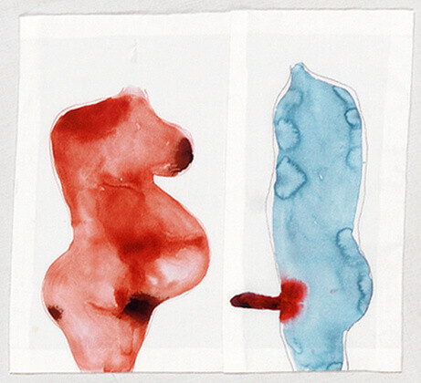
male and female figures by Louise Bourgeois
 \
\
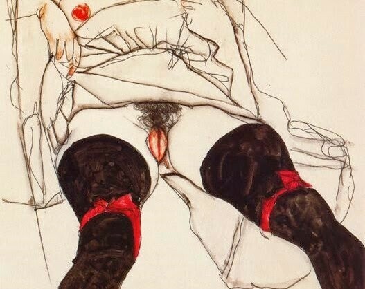
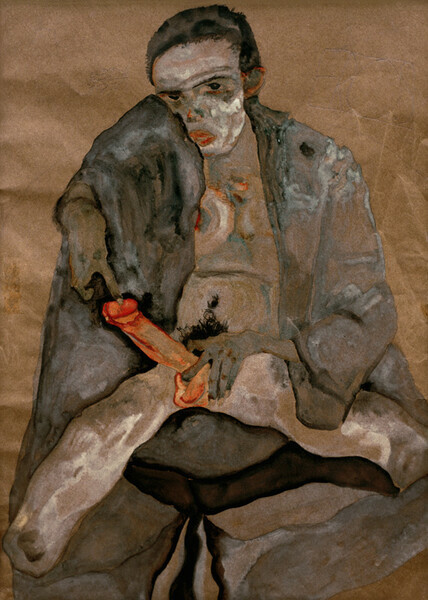
A couple of figurative works by Egon Schiele using colour to accentuate sexuality
In introducing the elements of art, and colour as an element of art to students, I was trying to elicit a strong emotional response and not simply provide an inventory of dried goods. The response might be disgust, repulsion or or pleasure, desire or anything in between including amusement. I think art, certainly art from the era I was imprinted in, was often designed to provoke. Of course my provocative approach to the elements of art might not be for everyone, but no single approach can be, and to the best of my knowledge no one was mortally offended or psychically damaged. And if they were they were perhaps they discovered they might be better suited to studying interior decoration and not visual art.
One final note on colour and the colour red. Not surprisingly red, or redness is often the colour cited by philosophers of mind as an example of the sensation of something. As in experiencing red. Or heat, or cold, or pain, or the fragrance of a rose. The sensation of the way things seem, the instance of how red is experienced by us in body and mind, has a name; qualia (singular quale). There's a lot of disagreement among philosophers, neuroscientists and psychologists about just what qualia are and even if they exist. If qualia exist they are intrinsic, private and experiential. But they are also ineffable and this makes the notion of them hard to pin down. This problem of definition perhaps isn't very different from consciousness, and possibly related. You know, or at least believe you are conscious, and you also believe you experience qualia as part of consciousness. But do you really? Perhaps it's most significant that we believe we do, we believe we are embodied minds experiencing reality.
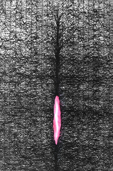
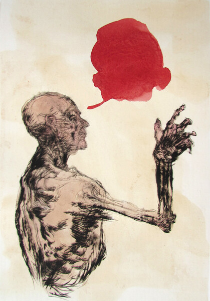
Below is one of my own prints which I called 'Qualia'. Don't think for a moment I was trying to illustrate the notion of qualia; I do NOT want to make illustrations. I don't like the notion of art illustrating ideas, even though I think art is full of ideas. It's why generally I don't like conceptual art. Conceptual or illustrative, I believe that art that tries to explain something becomes narrower. Titles can be a problem in this respect. I'm usually forced to give images titles for identification purposes; often I would provide a completely misleading title although sometimes I would have trouble identifying the image in my mind's eye when the title was misleading. But qualia was straight up what came to mind when I applied the blodge of red, by hand and brush, on the print surface to fill a vacuum of space that seemed to require filling. I think that all the figurative drawings I made, whether quickly sketched life drawings or considered images tried to convey a sense of what it means to inhabit a body and experience the body in the world through the senses. I think most figurative artists are often trying to convey this, and when something in an image successfully strikes a chord in the viewer it is perhaps more successful than not.
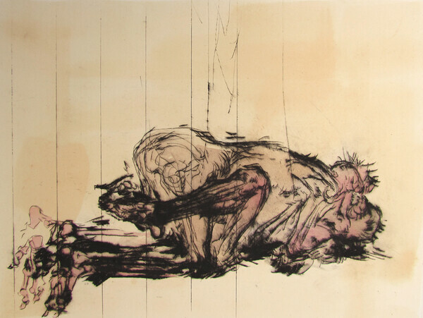
Below another print with visceral figures and hints of red.
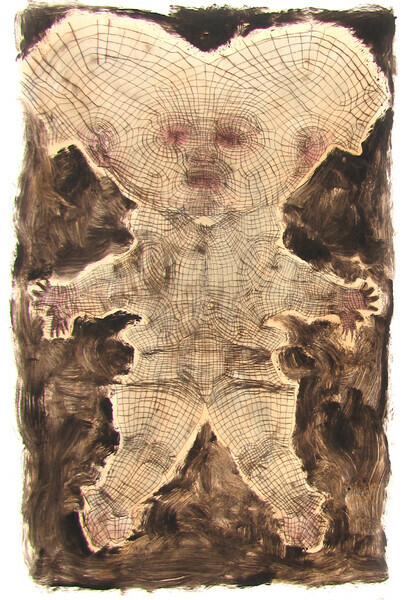
below another print in which I use some red tinting to try and increase, perhaps, 'tingly' sensation and embodiment.
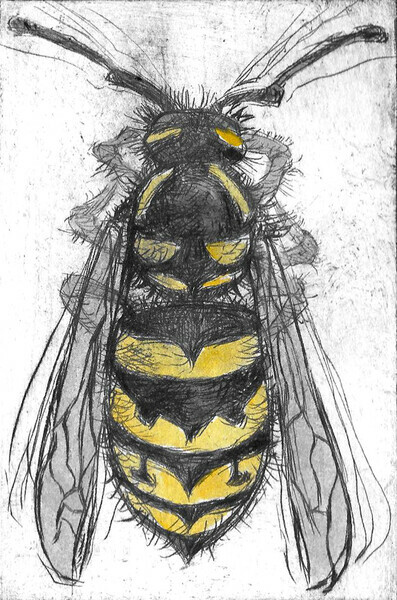
Below another print with a bit of colour, but not red this time. I find the combination of black and yellow alarming. It's often a motif on warning signs. Perhaps this comes from the colouring of some stinging insects and the evolutionary effect on our psyche. I find wasps alarming, like most people. They make an alarming, and perverse and interesting subject for a drawing. The colour juxtapositions heighten my senses and don't put me to sleep like more decorative colouring might.
I'll wrap up this blog post with one more of my prints. Again, these images just happen, there might be vague foundational notions, but in no way do I intend to illustrate. Meanings are usually found retrospectively. Obviously this is something abstractly wound-like on a landscape of sorts, and that was generally all I cared to know about it. It occurred to me to use red, which might make the sphincter-like form more wound-like, but red-red isn't actually very vibrant or a pure hue; it's not a pure red as in the magenta used in commercial print processes (along with cyan, yellow and black). So I used something close to magenta. I once spent a lot of time looking at punk rock LP covers and black and white xeroxed posters on telephone poles and these were usually a lot of black and white accented with livid magenta-pink so this might also have effected my choice of colour in this print for the purpose of highlighting. The colour was right out of the tube...