BLOG/WRITING
Mount Analogue. Topographic Complexities as Beacons of Increased Dimensionality.
Perceiving and then creating pictorial space and form was my occupation for four decades and three dimensionality, x, y and z axis's, have always been of great interest to me. The possibility that there might be other axis's careening off into un-perceivable space is nothing short of astonishing. When I moved west, as an artist I was transfixed by a mountainous landscape which often seemed to have more vertical (y axis) than horizontal (x, z) topography and was far more complex than anything previously experienced. The sublime is also of great interest to me, it should be noted, and though connected is not central to this post, as I want to primarily focus on experiencing increased dimensionality. I'm a big fan of sublime 19th century landscape paintings which depict scenes that in reality might swallow or destroy you; man-eating landscapes; views on the edge, views to die for. There is much I'd like to pursue in later posts about observed (and represented) sublime subjects and their link to visual information hazards; the notion of being visually transfixed by that-which-might-destroy you, such as the Medusa or a Basilisk, or Lot's Wife Looking Back to be turned not to stone but a pillar of salt. Or, as in David Langford's short story BLIT, 'The Parrot' stencil that is a visual information hazard, a basilisk image produced by terrorists that is fatal to view.

Lot's Wife Looks Back in a Gustave Dore engraving.

'The Parrot' from the short story BLIT.
The sublime induces a sense of awe, not in the current semantically bleached sense of 'that's like, awesome, dude', usage which probably emerged from irony. Awesome in the philosophical sense, whereby the sublime often occupies an incomprehensible space and scale beyond than that which is merely beautiful. Sublimity is as often something of great complexity like a mountain as it might be something horrifically barren, like a lifeless desert although both should be covertly or overtly threatening to varying degrees. Interesting visual art can often allude to the sublime. At the very least sublimity should make you aware of your tentative existence and at most crush you psychically by diminishing you, perhaps even to the point of experiencing a loss of self. My sense of the sublime is inevitably personal and, when looking for compelling visual art I try to find some evidence that refers to sublime experience or viewpoint (or at the very least the uncanny) because, I suspect, mute ineffable images communicate these sensibilities best. You might have, or might want to pursue, your own sublime sensibility. As mentioned, I didn't want to dwell too much on the sublime side of mountains in this particular post but rather look at increased complexity and dimensionality, but the two notions seem inextricably connected. On moving west to Vancouver Island I had previously loved the 19th century landscape tradition, and brooding, foreboding landscapes in general (I had spent a lot of time in, and painted 'the north', or near-north, in Ontario, a rugged terrain of rock, water and often stunted trees that even in summer anticipated the bitter winds of winter). I suspect Joseph Mallord William Turner would have loved Vancouver Island, and it's unpopulated heart of darkness, a complex mountain topography of peaks, chasms, gorges, glaciers, rising and descending vapors and savage weather. A place where hikers disappear without a trace and aircraft disappear off radar, lost in the complex folds of the terrain. Vancouver Island's population lives almost exclusively on the periphery of the unfathomable interior, in more pastoral conditions. It seemed most of the landscape painting here was done by island artists who had had their backs to the interior and painted the more sedate pastoral landscapes or pleasant beachy seascapes. I find the notion that life is a beach a bit ridiculous. I wanted to both personally and physically explore the mountains, through mountaineering and painting, in a spirit of awe, fear and trepidation. Perhaps like Turner or his contemporary Ruskin. I was shocked and astonished by the psychological effects of being on a mountain and the effort required to not panic or suffer anxiety and loss of self. I'm an anxious sort even in normal circumstances, but clinging to the side of a mountain was extremely unusual. As you leave the less complex flat lands, and gain elevation there seems to be an increasing sense of dimension. A given area, say a square kilometer, viewed from above on a topographical map over a coastal plain or prairie, would have a given surface area to walk on that is not much more than one square kilometer. However, over a mountain's summit block the surface area of a square kilometer on a map increases enormously, not just as a result of the vertical terrain but also due to fissures, gullies and arêtes. This is not unlike the surface area of 'activated charcoal' which, as a discrete object, is perforated with countless tiny holes that essentially increase the charcoal object's surface area. This is what makes it so superb at absorbing toxins and particles, and it's often an ingredient in filters for air and water. Same could be said for lungs or gills, whereby the surface areas inside the objects are increased in order to allow for more interaction of gases; importing oxygen and exporting carbon dioxide.
Another way, perhaps, to look at a mountain is as a highly complex Cubist object with flurries of facets, or planes, all angled slightly differently and also projecting off in to the surrounding space. When I was mountaineering not only was my situational awareness severely overwhelmed by a mountain's emergent surface complexity, but the surface itself contained innumerable perils to contend with. Getting lost in gullies, falling rock, 'bluffing out', betrayal of hand and foot holds, exposure to deadly falls. I found overcoming the actual physical risks, by practicing mountaineering skills, especially difficult when also trying to also contend with a kind of agoraphobia that grew with the increasing complexity and gaping maw of surrounding space. I was at risk of finding myself struck down as by a god; under such circumstances my peripheral vision might black out, and I might literally cling to the ground to prevent being suctioned off the face of the earth by the surrounding vastness of space. Of course, this was all rather thrilling and in it's way highly enjoyable. The more climbing and mountaineering skills and experience I gained the better I became at...not eliminating the panic and anxiety...but suppressing and savoring it. I got into rock climbing as well in a late life attempt to prevent myself from becoming a decrepit old sniveling wuss afraid of not just heights but potentially any of the complexities of everyday life. I can still recall being dozens or hundreds of feet off the ground and amazed to be able to block out peripheral irrelevancies and focus on just what was in front of me and the tasks at hand. Sometimes, feeling secure, I'd look away and into the abyss below me and think holy fuck where am I? Bear in mind I'm scared of heights. After a momentary spatial disorientation I would be able to re-focus on the tasks at hand. Climbing area crags are 'cleaned' rock and much safer with observable and carefully mapped routes upward, but back country mountains are larger, much more complex, chossy, and dangerous. Approaching the summit there is a lull in the anxiety surrounding route finding because the remnant of the 'summit block' ahead of you is now reduced, by gradual ascent, to a few hundred square meters on the map. As well, gullies and arêtes tend to converge at the summit. But they fan out on the way back down. And this was always a sickening worry mixed with the thrill of making the summit. How the hell do we find our way back down, down the labyrinth of gullys? I don't have great recall or memory and there is a fractal sameness to eroded mountain terrain; things look, if not the same, then very similar. There is also bad weather, which you try to avoid, but mountains are unpredictable and cloud can quickly move in and obscure distant features used to orient your direction for descent. And this makes the increased dimensionality of mountain blocks all the more of a mystery. That mystery has been frequently described in literature and film; Surrealist poet Rene Daumal's Mount Analogue comes to mind. There are clues to that dimensionality in the subtitle of the slim novel; Mount Analogue: A Tale of Non-Euclidian and Symbolically Authentic Mountaineering Adventures. Mount Analogue in the novel is on an island in the middle of an ocean that is very difficult to find let alone climb. Space around it and upon it seems distorted, if not hyperobjective, then at least hyperbolic. The training required of the expedition members to attain the summit involved psychic efforts of mind in order to slip around corners from one kind of space to another as well as mountaineering skills. Alejandro Jodorowsky made a Surrealist film based on the book, taking the preparatory measures of the expeditionary disciples to even greater and more surreal extremes; altered states as much as altered space. A trip to a mountain is a holy terror of sorts, those that survive might have their ordinary lives altered by the experience. This is conveyed effectively at the end of The Holy Mountain when the guru/guide tells the expedition 'Goodbye to the Holy Mountain. Real life awaits us.' Reality itself is a disturbing journey through dimension, through time and space, but we don't recognize it as such because we don't treat our everyday lives as an expedition to a Holy Mountain. But the skills and discipline obtained from psychonautical mountaineering might provide you with survival skills and insights for the real world, as much as as destroy you in another world, on the shoulder or summit of a mountain.

The odd ending of The Holy Mountain.

Jodorowsky himself played the guru mountaineer both in the film and through his domineering direction on the set.

On the literary front, Nan Shepherd's The Living Mountain is another contribution to the state of mind and perception required to fully appreciate the magnitude of mountainous spacial distortions. Shepherd spent her life not just climbing the Cairngorm Mountains in Scotland, but living under them, and rather than just climbing a given route to the summits she covered many routes, criss-crossing the vast complexity of the landscape and it's ecosystem and writing about it. She took the time, a life time, to attempt to explore every facet of a group of mountains Cubist- like and extra-dimensional structure. 'To aim for the highest point is not the only way to climb a mountain'. 'Yet often the mountain gives itself most completely when I have no destination, when I reach nowhere in particular...'
It's worth mentioning the recurrence of gurus and holy men associated with mountains. And holy women. People who have moved into other dimensions and experienced generally unseen sights returning with profound insights.

Nan Shepherd, a guru of sorts for the Cairngorms.
I suspect vast amounts of time spent drawing allow visual artists a glimpse of the hyper-dimensional, as though through a glass darkly. Certainly being able to see objects beyond 2 dimensions projected on the back of our retina or on paper or canvas. But possibly even beyond 3D, as in being able to view an object from an infinite number of positions in surrounding space. In fact, as with Cubist artists, space and form become so inextricably linked that one bleeds into the other in a kind of continuum. Drawing and thereby observing any object from multiple points of view is the deepest pleasure of drawing, recognizing your subject as an object in space, and, as you construct your drawing of an object, having it's construction lines vector off into surrounding space followed by the planes that the lines create. This 'classroom' observational drawing is what possibly lies at the root of the Cubist vision. As well, movement around an object mirrors any movement of the object itself, of motion, and motion adds dimension, perhaps of time. Basic observational drawing exercises seem the beginning of the perception of objects as far from mundane, as hyperobjects, alluding to complexity theory, the notion of a hyperobject moving through time and space accumulating history and complexity in the same way as an object like a species evolves into another species. Precursors of Cubism, and the Cubists themselves, could turn simple still life's into mountains of complexity, or they could look at a mountain in the distant and in painting it allude to, or infer, the infinite vectors and planes that project from it into space.

Paul Cezanne, Mount Sainte-Victoire
I don't begin to understand, mathematically or conceptually, just what an extra dimension really means or how it would be perceived. Obviously going into the mountains is not actually adding an extra dimension to perception, as in entering a 'fourth dimension'. Three dimensions still apply in the alpine; length, width and height on three axes. An actual fourth dimension would have another unfathomable axis. But it seemed to me that being in a highly complex, Cubist, faceted mountain-form so increases surface area and dimensionality it gives a taste of how disorienting a fourth dimension might be to experience for those accustomed to three dimensions. Mountains, it seemed, emerge from a less complex 2D surface into a fulsome three dimensionality with three axis's. But further surface complexity appeared to make them become emergent beacons over a flatter landscape of a sort that protrude into or onto a other dimensional axis. And when on them you find yourself becoming lost and confused on their surface. Mountains seem to enter another world, other dimensions, or 'many mansions'. Besides the experience of hyperspace, of higher dimensions, there are of course other metaphorical notional forces pushing mountains to places of altered space and consciousness. The prominent visibility of a mountain by cultures from plains below. The sensation of being'above it all' while on the shoulders or summit, above the mundane 2D surface of the world. It's worth pointing out here something I notice, as one familiar with the effects of linear perspective; on a summit the base of a mountain shrinks as it recedes to vanishing points under the earth making the summit, and the rock underfoot, appear disturbingly precarious so as to seem like you are to some extent hovering or defying gravity all the while objects on the plains below shrink and move toward the vanishing point deep in the earth. As well, although many people never physically enter mountain precincts and so only visit in their imaginations, which can be as large as the mountain itself. The distant echoing rumbles of landslides and avalanches, vulcanism, lightning being hurled from peaks surrounded by cloud make the mountains the home of not just the supernatural but supernatural creatures; abodes of the gods. Some who visit such places experience the increased hyperspace because they might also be shrouded in cloud and weather, a further mystifying the experience that confounds dimension and distance. For even greater mystery, on some holy mountains, like Kailish, climbing is prohibited and there are no known ascents. Olympus, Sinai, Kailash...the list of holy mountains is long.These hyperdimensional 'effects' listed above, and many more, both perceptual and metaphorical, account for the recurring theme of 'sacred mountain', or 'holy mountain'.
So, going into the mountains, or up a mountain, is not actually going to a different dimension, say the fourth...
Visual Intelligence
I'm giving this thoroughly enjoyable and fascinating book by Donald D. Hoffman a second reading at the time of writing this. Hoffman has put together a compendium of the algorithmic rules that determine how we humans, and probably animals, extricate information and construct form from the chaotic 2D splatter of colour and value on the back of our retinas. Hoffman lays out how rules apply and how other rules might over-ride other rules under specific circumstances. Some rules seem well understood both conceptually and in terms of brain and eye physiology but for others current research can only speculate why they work. Any visualist who has taken the time to put in the thousands of hours required to draw well could find this book fascinating through the recognition that most of the brain's visual construction rules are the very same rules visual artists apply when constructing and arranging coherent form in the pictorial space of a two dimensional surface. Drawing might be a sort of reverse engineering of our innate read-only visual intelligence into a writable system, through practice and skill, that can be applied with stylus or brush onto a sheet of paper or a canvas. This is why the book will probably appeal to artists, or at least those artists who have taken the time to draw...to describe form...exceptionally well. It probably won't appeal to conceptual artists, or those artists who prefer words or ideas to images. It also probably won't, or shouldn't, appeal to those learning to draw, that is students, because, I suspect, being too self aware of processes while learning skill could undermine necessary unconscious 'flow' and hobble you. But, once you have a chunk of a lifetime spent drawing behind you this book becomes magic because it so comprehensively lays out much of what you already know.

This is a pipe! As a visual artist, on the one hand, i've always been annoyed at the somewhat 'anti-art' notion that this 2D representation is 'not a pipe', and also Magritte's title for the painting 'The Treachery of Images'. It's a representation of a pipe, so it is a pipe we are perceiving. Surely Magritte might be being nuanced and even ironic in his title, because, if we see a pipe, then it is for us in an ever so astonishing, quite delusional way, a pipe? Just writing or saying 'This Is Not A Pipe', like some kind of hex, doesn't make it not a pipe. Surely it is at least both a pipe and not a pipe? The treachery could as easily be of words, and as a visual artist god only knows I find words as treacherous as images. Here is the 'other hand'; if this painting of a pipe were not a pipe, then looking at an actual pipe before our eyes is also not a pipe because it's actually a delusional perceptual construction from a two dimensional splatter of light in the back of our eyes. It's delusional pipes all the way down. There is magic and mystery (and creative intelligence Hoffman shows) in seeing, especially in the realm between two and three dimensionality. British artist Michael Craig-Martin recently said in a Guardian item “A painting of a shoe looks nothing like a shoe, being entirely flat and made of bits of colour put together. The miracle is that we look at it and can see a shoe as clearly as if there was a shoe in the room with us." This is a shoe, if it fits, wear it, although ultimately Hoffman's fascinating research is probably suggesting, somewhat alarmingly, that if it's not a pipe or a shoe you are seeing then nothing is actually what it appears to be, but rather a fabrication created to make ends meet as best as possible negotiating in a complex world. Seeing isn't necessarily believing, and this is something that learning how to draw well makes eminently apparent.
Reading the Hoffman book working artists who draw and paint will recognize the uncommon 'accidents of viewpoint' like co-linear and co-planar alignments that you try to avoid in composition or the straightforward drawing of objects on a table. Should you happen to encounter accidents of viewpoint in your field of vision when drawing and put them in your image they would introduce confusion into the 'reading' of your image by a viewer. So you move things around, or move your point of view, left or right, even a little bit. These occasional accidents of viewpoint when encountered in the real world confuse the brain; one of my favorite examples of this, one that I often gave to drawing students, was a story printmaker David Blackwood once told me. From a small outport in Newfoundland residents had been telling tales of seeing a headless woman in a pale diaphanous robe or nightie in the moonlight in the surrounding barrens. It might be some believed what they saw or that some were having fun, but in the tales the instinct was generally to run away as fast as possible. Blackwood himself claimed to have encountered the apparition walking home late at night and managed to suppress the instinct to run but rather risk a firm gaze. Within moments the apparition became aware of his presence and the white horse turned sideways and gazed back. He was looking at the arse end of a pale horse. I always like to recount that story when making the point that vision is generally trustworthy but not always and that seeing should not, in fact, be believing. I think visualists who draw are uniquely placed to recognize this reality.
When accidents of viewpoint are applied to carefully designed illusions they deliberately 'confuse' the visual mind, or, at the very least, lead it to construct alternate images or alternate readings of form. In the well known Necker Cube, for example, your brain flips the aspect of the cube back and forth, showing how the mind can 'construct' what you see in two separate ways. The book is full of such illusions illustrating how the rules apply and how they might be broken. The overarching rule seems to be the 'rule of general views' which is a kind of wager that rules out the prospect of the uncommon accidental view through probability. In a way all the rules are wagers on probabilities based on accumulated information and experience that the brain makes to interpret the retina; it is far less likely that things appear one way than another so the brain goes with the much more likely scenario. It's when an unlikely 'accident of viewpoint' occurs the brain occasionally loses the wager and sees something quite different from actuality, like a headless female apparition in the moonlight or a cleverly designed illusion.
This book is doubly interesting for me because not only did I work long and hard to learn to try to draw well, but I also worked as a background painter for animation. Backgrounds, in animation (or live action) have to do several things; establish mood and location without distracting from the interacting characters. This means they almost always need to be a completely comprehensible pictorial space for the brain. If, for example a theatre-goer experienced some kind of confusion about what they were seeing in the background it would capture their attention away from the narrative and characters. Everything in the background should generally make complete visual sense. Furthermore, most scenes in a film, animated or live action, are around one or two seconds long. So you also have a severe time constraint on being able to make sense of what you are seeing behind the characters. Awareness of 'the rules' of visual intelligence are therefore constantly referenced, knowingly or not, as you make sure that your background painting is easy to 'read' on the retina by ensuring there is no ambiguity for a brain wagering on probabilities about what it is seeing. This lack of ambiguity in ideal background paintings is somewhat different than what might occur in an illustration (or a painting) where a viewer might have more time to lavish attention; in fact, some ambiguity and effort might actually make the image more interesting as in, 'hey wait a minute, what is going on here'.
Visual intelligence helped me place another visual interest I've had and casually read about that at some point will require a post of it's own in future. I've always been a little perverse. As a visual artist I worked ever so hard to make form extremely comprehensible to the eye and the mind, accept on occasions in my own work where I might have wanted to use ambiguity to create interest. So I always wondered about how artists might reverse the rules of visual intelligence to obscure or even annihilate perceived form. If you are fascinated at constructing form it follows that you might be just as fascinated by processes that involve de-constructiong it. This is of course the realm of visual 'stealth'. Yehudi Lights on aircraft mimicking 'lights' on deep sea fish. Dazzle camouflage on ships at sea to confuse submariners. Camouflage on uniforms and aircraft...an animals. It's counter shading on military aircraft and animals. And of course it makes a lot of sense that much of the early work on obscuring form was done by artists, including the first person to describe and analyse counter-shading, American artist Abbot H. Thayer.
Because of or in spite of my fervent enthusiasm for this book, as a visual artist I was struck by a glaring and annoying omission. Hoffman lists the 'tourists' who will appreciate and enjoy his book on visual intelligence as people in marketing, advertising, graphic design, readers of popular science, undergraduates with undeclared majors, developers of virtual worlds, lawyers concerned with eyewitness testimony, and philosophers. But not artists. WTF Donald! Art and artists, often working hundreds of years ago, are referenced on a number of occasions in the book for showing an awareness and understanding of how to apply the rules of visual intelligence to describing form. What kind of accident of viewpoint, blind spot, or illusion prevented you from including us among sorts of people who might appreciate your writing and research?
Beyond The Fringe
I recently had some positive experiences where artists exhibited under circumstances where there was no gate keeping by institutional 'art experts', who are as often as not, not artists.
-I was in a group exhibition of printmakers that was not juried. Any regional printmaker could enter and there were over 70 artists, most who submitted more than one piece. No one was denied entry and the quality of the work overall was superb and a testament to the visual activity of printmaking in general and on Vancouver Island specifically. There were pieces that didn't appeal overly to me of course, or were pretty amateur, but overall the show was visually gregarious, interesting and showed a wide variety of techniques and artistic facility. It was certainly as good or better than curated exhibitions I have visited. Now, although there was no gate keeping, printmaking is a fairly technical visual activity that involves a degree of commitment and effort, as well as the confidence to enter a show. So perhaps this fact acted as a kind of gate-keeping, performing a similar function to a jury, or an arts association which requires application for membership. Print itself has an unusual quality of 'detaching' itself aesthetically from the hands-on experience of the artist, I often notice that I look at my own prints more favorably than my own drawings or paintings; the prints look 'detached', as though someone else did them and generally I am easier in my judgement criticism of others than I am of myself. Regardless of how pre-loaded with aesthetic interest any print comes charged with, whether it's a good or bad print, the regional print show was an astonishing example of how you don't need institutional art experts in the exhibition equation to get a good show. Artists themselves are quite capable of pulling it off.
-I noticed a nearby community public art gallery offered a small gallery/space for rent, no jurying, curating or gate-keeping of any kind. Eighty dollars a day. It occurred to me I could do a pop up show there. I 'promoted' it on social media for a month or so, showed up on the day, put stuff on the walls, sold some things, took it down and exited through the former gift shop. Another group of printmakers did the same thing some weeks later. Both our shows exhibited a wide variety and large quantities of work. You could spend an hour or two as easily as 20 minutes at both exhibits, whereas in a formal curated and vetted shows exhibited images or objects are stretched pretty thin and I'm often done looking in significantly less time.
-In my own community there is an artist and therapist who has opened her space as a rentable gallery. She also has invitational exhibitions. On some occasions, when scheduling allows, she will book single day 'pop up[ exhibitions of the sort that I mentioned above. In the five years of her galleries existence she has probably exhibited a hundred local and regional artists in an area where opportunities to exhibit are slim. Although she selects artists for her invitationals, her gallery model also provides for artists organizing shows for themselves and the quality of exhibitions has been as good as anywhere in this region. Her gallery model has a fringe element.
All of the above arrangements could be thought of as 'alternative' or 'indy' or 'fringe' gallery models that allow art workers...artists...to side step arts 'management' and 'bosses' and the constraints, controls and even suppression that 'management' imposes on the visual arts. In the case of of the person offering her space to artists, no government funding is received for the proprietors efforts or for the artists. Meanwhile generously funded public galleries that conform to government mandates, whatever they might be, receive relatively massive injections of cash on an annual basis, most of which goes to operating fees and a throng of employees. Artists fees make up a tiniest fraction of expenditures.
A quick search of Fringe Festivals will now find them all over the world. There are even some 'fringe' visual arts festivals. Some festivals and galleries are obviously schemes to fleece artists in much the same way as what we used to call 'vanity galleries' used to do. Some public gallery organized festivals charge artists to raise funds for the very institutions that the artists would in all probability never be permitted to show their work in. This is the case with The Moss Street Paint-in in Victoria, where artists pay a substantial fee to 'rent' a strip of dirty sod at the edge of a road. At their best, fringe opportunities should be free or require only nominal entry fee because, in general, the economic viability of artists in Canada is dire. The original Fringe Festival in Edinburgh was a response to the Edinburgh International Festival, a high brow arts festival initiated in the wake of WW2 with the high minded intent to help heal the wounds of war through the languages and forms of art, particularly music and theatre. Performances were obviously well considered and carefully selected to provide for the organizers notions of high quality. But gate-keeping, by arts elites, inevitably keeps most performers or artists 'out', at bay, away, shut down. So from the very beginning of the Edinburgh Festival 'The Fringe' arrived in and around the city with uninvited troupes of performers arriving and taking over smaller venues to tempt and perform to the assembled consumers of the official theatre. Again, I like to frame this response to gate keeping as arts-workers taking the arts into their own hands and not behaving complacently in the face of arts management bosses. The key to most Fringe festivals is no jurying for entry. The Fringe Festival in Edinburgh was so successful that the main arts Festival itself created a late night revue to compete called Beyond The Fringe, which became the well known comedy stage review with Dudley Moore, Peter Cook, Alan Bennett and Jonathan Miller. I've taken the title of this post from this comedy review, with a mind to getting beyond fringe festivals to the notion of fringe galleries and fringe art exhibitions; scenarios with no gate-keeping and jurying.
Around 2023-4 I'll be damned if I could get exhibitions for my fairly prolific production of printed images in public or commercial galleries. I live on Vancouver Island. Commercial galleries want stuff they can sell and here it seems to be lots of pretty pictures, from non representational arrangements of brush strokes and textures, views through birch trees, pears, koi fish, landscapes of beaches and forests usually done in pleasing pastels using whites and primary and secondary colours or vivid hallucinogenic primaries, eagles, bears, and whales. In the public government funded galleries alleged to have strict and narrow 'mandates' (so I am repeatedly told) the primary consideration is social engineering involving progressive ideological notions and exhibiting images and artifacts that can be explained and provided with written interpretations. The exhibitions often consist of 'installations', where the art such as it is exists for the duration of the exhibit within the gallery space as something assembled, projected or quite literally transcribed onto the gallery walls, all to be dismantled or annihilated at the end of the show, essentially devaluing the product of artists labour to ephemeral non-commodities. The function of the art, such as it might be, is adding value to the gallery space, the curators discretion and the institutional and technocratic nature of the exhibition.
A key talking point of contemporary public galleries is 'engaging the public'. But public galleries are like temples and the highly curated contents presumed to be excellent. The public dare not be too engaged or too not engaged. The whole system begs the public to leave judgement to the experts who justify the show, which is less like a back and forth engagement but rather a kind of infusion and indoctrination by the institution and it's experts. It's not unlike attending church. A church service doesn't make it easy for those in the pews to quibble with the sermon or service. It's not very often someone stands up and interrupts the official doctrines being broadcast. Public institutional galleries inevitably talk down to their public, who they like to suggest they are 'challenging' if ever a discouraging word comes from the visitors; in any disagreement about value the visitor is assumed wrong. Engagement is one way, didactic, essentially autocratic. However in an un-curated fringe show the public would be fed no positive preconceptions that the work is necessarily 'good'. The public would be required to make up their own mind. Required to consider and not dutifully accept. They would need to do the work of discernment. They can clap, talk back, laugh, gag, argue, throw rotten fruit, boo, turn on their heels...situationally a fringe gallery seems orders of magnitude more engaging than an official institutional event.
The fear of humiliation is real for anyone who takes themselves their visual art seriously enough to organize a solo exhibition or participate in a group show. It takes confidence and probably a lot of hard work to accumulate work to hang on a wall for even one day (I had over a hundred discrete images hanging on the walls of my pop up show in the rental space and hundreds more in folders representing years of full time effort). Of course, there will be the odd deluded megalomaniac who will exhibit in a fringe space. But they and every exhibitor will risk humiliation, something all artists have to face. The hard work required and the risk of humiliation and failure should act as a kind of gatekeeping.
As mentioned, I've already witnessed some fringe visual arts venues locally. So what would a fringe gallery look like and how might it operate at a publicly funded institution?
There would be little to fuss with if there was a fringe space in a public institution. The public gallery would simply provide one of it's rooms, empty, painted white, one day a week to any artist who might pay a nominal fee to rent it for a day for a pop up show. Say a Saturday. The artist would arrive and hang the work, install the work, and an arts event would take place over the course of the day when the gallery is open. Obviously I'm thinking of hanging visual on the walls, but it could be dance, installation, a comedy routine, music, or poetry. The gallery bureaucrats would have little to do with exhibitions at the fringe. The fringe space could be used by the establishment during the week when it isn't active. When active the culture of community artists would authentically emerge and occupy the provided space. Culture being pushed down from 'above' by institutions and their civil servants is colonial; culture seeping up from 'below' is authentic and indigenous. Artists are quite good at creating their art, but it's time consuming, and doesn't leave them much time to promote it or find venues and space; space and the opportunity to fill it is the most important thing that institutional arts should be providing both artists and the community.
'My God, it's not full of stars...'

I've often liked to think of drawing, which of course involves taking the time to look intensely at form and space from a human perspective, is a a conduit to critical thinking. This is in good part because if we draw a lot we very soon discover that what we perceive with our eyes is not the same as what is seen with a camera, despite the eyes structure being very similar to a camera. What we think we see is not a wholly reliable source of information. We learn by countless hours of especially observational drawing, which involves careful and intense 'looking, that what cameras 'see' or capture is often vastly different from what is perceived before us. Drawing makes us...well it certainly made me...have less trust in what I think I see. I'll probably do a number of future posts that deal with this notion in various ways.
The title of this post, of course, alludes to what astronaut David Bowman exclaims when he enters The Stargate, not in the movie, which is sublimely silent except for mounting ethereal choral music, but in the novel by Arthur C. Clarke based on his own screenplay for Stanley Kubrick's film. In the book, which I read decades ago and don't have on hand so can't actually check, so am relying on Google...Bowman says 'My God, it's full of stars.' Actually what he says in full is "The thing's hollow -- it goes on forever -- and -- oh my God! -- it's full of stars!" And that's generally how we think of the universe; full of stars. We think that because that's what we see when, without light pollution, we look into the night sky, and even bring to bear binoculars or telescopes (camera devices) on small sections of the sky, bringing even greater numbers of stars into view. And in fact, the deeper we zoom into space (and therefore time) the more and more stars and other even larger and further celestial objects emerge into view, allegedly going back to shortly after the Big Bang, when the universe first began lighting up, in one wavelength or another. Closer stars might still exist; further stars no longer exist, their light is only just arriving billions of years later. So, by looking up from a location without light pollution, or from telescope photography, we are easily convinced the universe is full of stars. This conviction of a universe brimming with stars is further fortified by our reading of science fiction, or viewing of it in films, which are fairy tales of sorts, in which interstellar civilizations are regularly conjured up, along with vast populations of multiple species of intelligent technological aliens. The number of stars in the observable universe is truly staggering, even more staggering than we can actually imagine, and beyond what is observable are staggeringly larger numbers forever denied our viewing because of the inflation of space. Our comprehension of numbers...mine anyway...unravels in terms of comprehension similar to this; one to ten (when I run out of observable fingers), then ten to one hundred (I could once count to 100 without losing my train of thought)...then proceeding to uncountable 'lots'...to even less estimable massive amounts...then to incomprehensible quantities (incomprehensible to me)...despite the mathematical devices to make them workable, like exponents. The Drake Equation, which takes these enormous numbers of stars and therefore presumably planets in our galaxy, attempts through equation inputs, to come up with a probabilistic number of planets with life, intelligent life, and civilizations. It's a thought experiment, and it depends how enthusiastic you are with numbers, or with the possibility of emergence of life and technological civilizations on other planets (bear in mind that on Earth, life started almost immediately after, heck, possibly even before the cooling of the planet). Whatever numbers/probabilities you punch into Drake's equation, low or high, surprising results are yielded, and it is easy to imagine a galaxy teeming with not just stars but inhabited planets and technological civilizations. (Of course, if this is the case, for technological civilizations, where are they? This is The Fermi Paradox, another wonderful device that asks a simple question, 'where are the aliens'). The Drake Equation, and results distilled from running it, also provide a felt sense of the staggering number of stars in the sky. Finally, recently this impression has been further fortified with space telescopes; first the Hubble and now the Webb. We can now find photos of the tiniest of tracts of the night sky that are almost white with stars, and can infer that every part of the sky would be similarly populated. Indeed, it seems that if we could see far enough into space with a long enough exposure the night sky would be pure white. Everything we see and hear about space points to a universe chock-a-block full of celestial objects.

Obviously the title of this posts suggests I'm suspicious. As an artist I know that what I think I see and am stimulated to visually imagine/infer isn't necessarily as things are. I've been deluded by my own eyes many times...actually I'm deluded by my brain which constructs what I perceive from what my eyes see. Only by careful observation, through drawing, have I had a different visual reality revealed to me. As well as observing form I study space. I know how focusing in on, cropping, 'zooming in' alters visual reality. It's been a tool to attempt to create dramatic landscapes, and is a device that photographers use regularly to tell visual lies, for example, for travel brochures. I know how the relationships between various objects embedded in three dimensional space can be altered by projecting them on to a two dimensional surface (or imagined one), which is what I often do when drawing and measuring angles and proportions to transfer to my paper. I know how depth of field can be contracted to almost non existence. In the vacuum of space, if no one can hear you scream, light nevertheless travels incomprehensibly long distances.

Above, Sergei Eisenstein allegedly used the Odessa Steps, which have a 'forced perspective'...narrower at the top than bottom to shoot the massacre scene to make the Czar's troops at the top appear subtly larger than life. Allegedly The Emperor Justinian, in his basilica in Constantinople, employed a similar technique. The basilica was less high and less wide at his end, so that when supplicants arrived through the entrance at the opposite end, the forced perspective suggested that Justinian, raised on his dais, was larger than life.

Above, the Ames Room Illusion, in which a single viewpoint of an asymmetrically distorted room in which people who are actually far apart appear to be at the same level of pictorial depth. Forcing perspective is one way of altering perception to convince you that what you see is something different than reality.


Above, a couple of my own quick in-class sketches made whilst demonstrating perspective grids to show how 'zooming in' through cropping, can make far-away objects like the mountains appear to loom over the foreground.

Above, the same effect used by a photographer on a day with clear atmospheric conditions (little or no aerial/atmospheric perspective) uses a zoom lens to bring distant objects, like icebergs, up close. This is a highly distorting device used by photographers in, for example, travel brochures, which could make an uninteresting hotel or community seem closer to a distant place of interest.
When teaching, I used to devote time to the lies that our vision, and cameras, propagate. I'd give examples of different camera views (upshots and downshots), different vanishing points on perspective grids, examples of altering the relationships of objects in space. If I were still teaching now I'd start with the universe, and the assumptions that we might be inclined to make about it; that it is teeming with stars. Because, as you know, I'm not just suspicious about this notion, but know that if we frame our field of vision differently the perception will be 'My God, it's not full of stars...'
In order to re-frame my notion of the universe I wondered how...let's start with our galaxy...might appear if an average sun/star were the size of a grain of sand. I Googled 'if our sun was a grain of sand...' and discovered of course, I'm not the only person who has wondered this. The conjecture is apparently epidemic in science classes.
So, if suns in general were the size of a grain of sand, there are various napkin calculations available, that all more or less suggest awesomeness in the original sense of the word. There's apparently about 100 billion starts in our galaxy, the Milky Way, so, how much sand would that represent? Apparently half a tennis course 1 meter high of sand. That is an astonishing amount of sand, and we would be justified in thinking that, yes, our galaxy and universe is teeming with stars. But lets spread those stars/grains of sand out to real distances. Lets collapse the astonishing depth of field that astronomical photography represents. If the sun were a grain of sand, our solar system might be 3.5 meters across, or 30 km across depending on where we define the boundary and how big we define a grain of sand. If our sun were a grain of sand our Milky Way galaxy would be 350,000 km across. So imagine the sand representing stars in the galaxy on that half tennis course scattered about on a disc 350,000 km wide. Sand/matter becomes incredibly diffuse.
For me, the universe has potentially become a lot emptier. The various answers to 'where are the aliens', The Fermi Paradox, is altered radically in terms of probabilities. Answers that I might have bet a little bit of money on I no longer would. It seems likely the aliens simply can't be found in space...and also time...which is dimensionally as preposterously, staggeringly, large as space itself. Trying to locate aliens, or have them locate us, would be more difficult than finding a needle in a haystack. The shocking revelation of how vast and almost empty our galaxy is makes me question how feasible communication over vast distances might be, even if we found another needle in the haystack and acquired the energy and technology to beam interstellar communications, a potentially dangerous thing to do considering we would know nothing about the nature of the recipients. And interstellar travel also becomes a more distant possibility than even some of the more distant stars. The likelihood that we have been, or are being, visited by aliens, seems not impossible but nevertheless inconceivably remote and makes all the various popular past and present claims seem not just unlikely but almost absurd. Even if there are billions of alien civilizations across time and space we might as well be alone. This is probably all there is. This is probably all we have. The here and the now. At the very least this scenario becomes so likely we should be very careful with what we have and proceed with caution into the future because if we destroy ourselves no one might ever know we even existed.
It's drawing that made me think about the universe like this.
The Cambrian Era of Jet Evolution
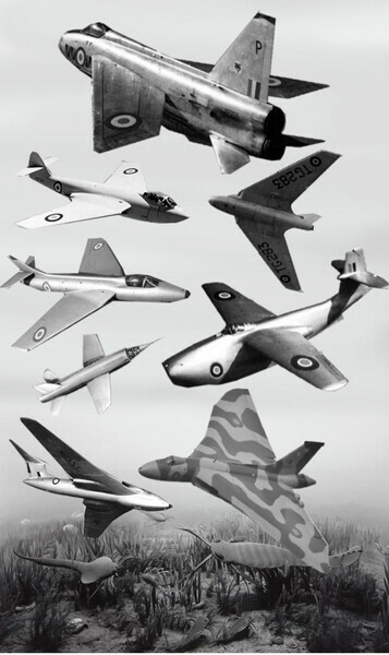
Since childhood I have loved looking at pictures and dioramas imagining the Cambrian Era, and the whole idea of the Cambrian 'explosion' of life forms. As well, I grew up looking at pictures of great British aircraft, particularly jets. (Apologies to Hiroshi Sugimoto who took photos of museum diorama's, including the one above, to which I added what I think might be Cambrian looking jet aircraft).
The Cambrian Era, starting over 500 million years ago, was a period of rapid evolutionary growth and experimentation of (mainly) invertebrate aquatic animal life forms on a planet whose biomass had previously developed little in the way of complex multicellular life. What really intrigues me are the experiments the evolutionary algorithm provided by creating very peculiar complex life forms, many of which, either elegant or bizarre, subsequently became dead ends. In a way...I'm pushing the envelop a bit here...I see the early days of jet aviation spearheaded by the British after WW2 as somehow analogous to the Cambrian Era. The British, despite careful planning early in WW2 to be foremost in the field of jet technology, lost their edge to the Americans and became an evolutionary spur that might have continued in different circumstances in a Phillip K. Dick parallel universe. When, teaching occasionally as I did, I wanted to introduce some interesting looking design traditions to a class, and encourage them to look in strange places for design elements, I'd often give them a quick visual tour of early British aerospace. The British used various recurring design features which look functionally aerodynamic and elegant to my eye, but which have generally been phased out of aircraft production by processes that might be parallel to evolution. These design features provided advantages at the time but not over time; much like the unusual design features of Cambrian life forms.
My interest in Cambrian life forms and early British aerodynamic forms is perhaps fetishist as a result of early exposure to both subjects in books, and in the case of aircraft, both books and 'Airfix' models; and of course, relentless drawing of these forms. A very early fixation was, of course, the British Supermarine Spitfire, Wartime Britain's top of the line interceptor famed, along with the more pedestrian Hurricane, for winning the Battle of Britain. I can't tell you how many hours I gazed at this form as a young child, anywhere I found it. I fondled my Airfix models affectionately. There has to be a kind of eroticism to such a beautiful form, and I must have been imprinted similar to how I was imprinted with an attraction to the form of the human and particularly female body. Look at the beautiful thin monocoque 'elliptical' wings of the aircraft below, which gave it superb speed and handling. It's slippery and fluidly dynamic movement through air was a cue to other British prop aircraft like the de Havilland Mosquito (not shown) but more importantly, for the shape of fast moving new airborne objects the jet age.
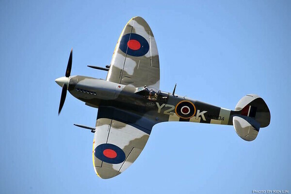
Spitfire; Photo for the Comox Valley Record by Ken Lin. Looking at this photo gives me unfathomable pleasure, of the kind I used to enjoy holding my Airfix model spitfire and imagining it moving through space. In doing so, having it turn, roll, dive and climb, I viewed it from every conceivable angle. I don't believe visual memory is photographic, but that repeatedly imprinting forms on the brain creates mental templates which allow you to reconstruct the form or derive other forms from it. This is akin to life drawing for years and years perhaps, which creates biomorphic imprinted templates, in the same way that viewing and drawing the spitfire from multiple aspects/angles creates aerodynamic templates.
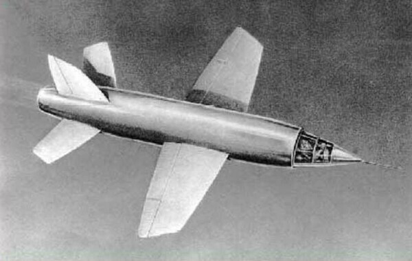
The Miles M.52, Britain's attempt to be first to break the sound barrier with an air breathing jet and fly at 1,000 mph. Developed during the later stages of the war, design work was complete and three prototypes were being built before the end of hostilities. The design had the first 'all flying tail' to prevent loss of control due to compression at high mach speed. But Britain was financially devastated by the cost of the war and the project was cancelled before any maiden flight. Much of the data and design work that had accumulated was passed to the Americans for their rocket propelled Bell X-1.
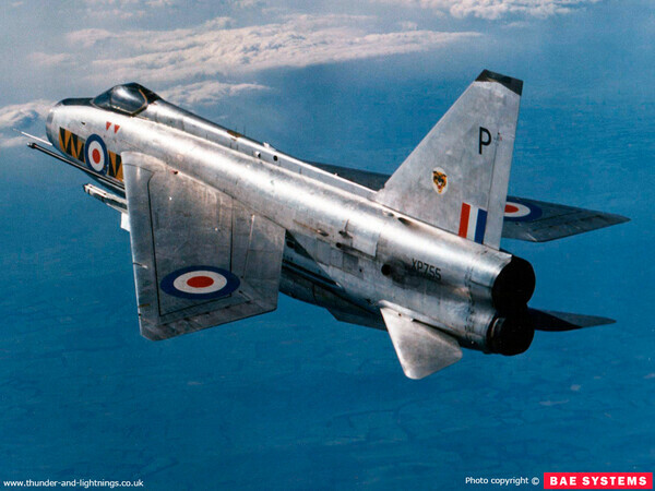
The English Electric Lightning interceptor with an unusual stacked engine design and gorgeous wing structure that seems something between a delta and highly swept conventional wing. The aircraft had outrageous performance rising to high altitudes in order to intercept Russian bombers should an end-of-the world scenario occur.
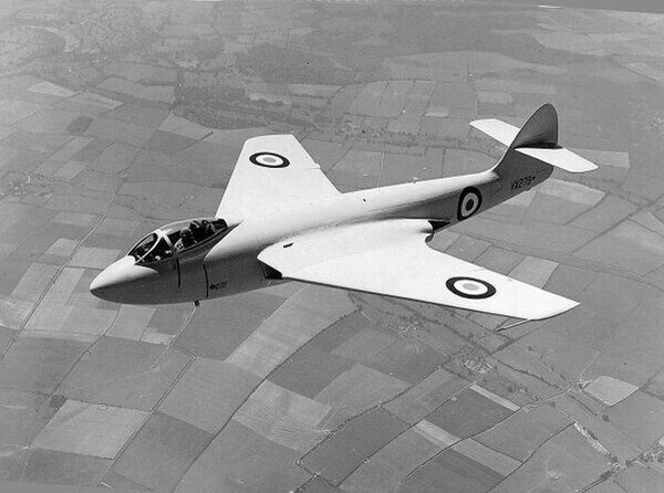
DeHavilland Vampire; this jet was available to the UK before the end of the war but they went with the two engined Gloster Meteor. Both were fairly conventional designs in terms of air frame, although DeHavilland went with wood as the primary material as they did with the Mosquito.
Based on the Vampire, the DeHavilland Swallow was an experimental design which explored a tail less design as proposed originally for the Comet airliner. Instability at mach speed caused buffeting and disintegration and the death of Geoffrey de Havilland Jr., test pilot and son of the company founder.
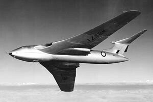
The first jet powered water based aircraft was the experimental Sanders-Roe SR A/1. Less novel than it might seem today, because of the pre-war development of fast sea planes, it could nevertheless not compete with land based jet fighters and was eventually scrapped.
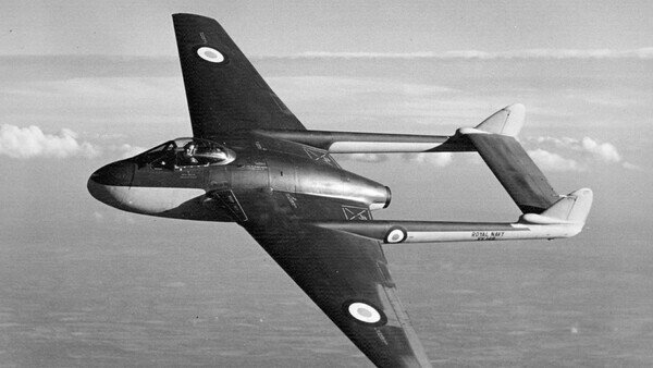
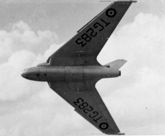
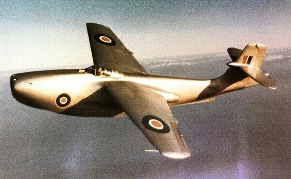
As Cambrian as it can get, above, and below, the astonishing Handley Page Victor doomsday bomber, the British equavillent of the B-52. The Victor's gill-like air intakes at the base of the wings look spookily alien. Notice how many of the British Cambrian Era jets have interesting and complex wings with their engines and engine air intakes buried in the wing roots. Including the Comet airliner. This made great aerodynamic sense but made servicing difficult and also, in the event of an engine disintegration, the risk of hull and wing structural damage. The Americans, as had the Germans with their jet fighters, put their engines in pods under the wings which was more practical, but less beautiful, less aerodynamic, and less Cambrian. The Victor also had a beautiful Crescent Wing (see below); not the first use of the wingform, but an exquisite example and it made the jet slippery and fast in the air. In a shallow dive it broke the sound barrier and apparently handled beautifully at slower speeds of take off and landing.
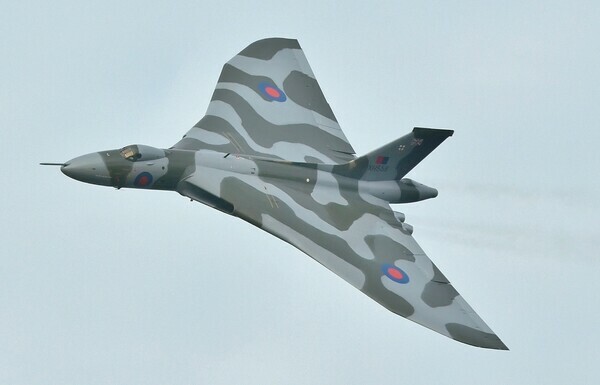
The Avro Vulcan, another of three Britain's 'V' Bombers. Harkening back to the DeHavilland Swallow with it's delta wings and wing root engines and intakes, the ogee shape in the leading wing edges looks ahead to the superb looking wing on the Condord.
The Hawker P.1052, a prototype for development of swept wings. Again the engines and intakes in the wing roots, and a beautifully balanced looking aircraft which contributed to the milestone Hawker Hunter.
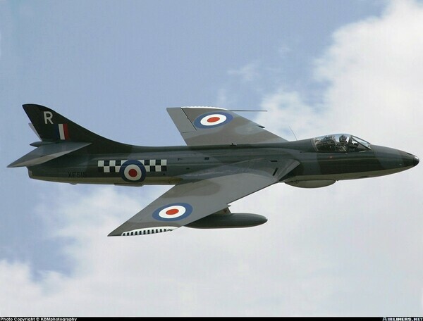
The Hawker Hunter, still a superb looking jet intercepter to this day.
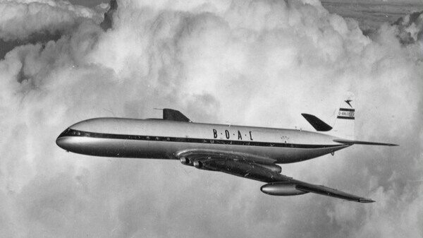
The DeHavilland Comet. The worlds first jet airliner to take flight. Look at that beautiful nose; the wing area seems huge in plan views and evidence for it's original delta winged design. The tail assembly looks old fashioned and slapped on alas, and worse still, despite extensive and unheard of levels of development to prevent metal fatigue, after a few years Comets began to break up in flight. A years long, again unheard of, effort to locate the flaws ensued, and after successfully solving the issue the Comet again took to the air. But too late. The Boeing 707 became the state of the art air carrier and Britain lost it's post war bid to become a major player the civilian aircraft market.
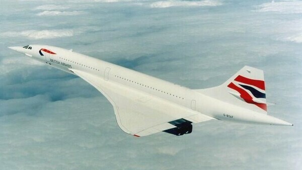
The Concord. I remember watching the maiden flight on the telly, and being disappointed the stalky looking landing gear wasn't retracted. One of the most exquisitely shaped objects ever conceived and constructed, a British/French joint venture. The ogee curve, a lovely lazy 's' curve that I've always loved in figurative art or design and architecture allows the required superb aerodynamics required for speeds above that of sound. Ironically it was ground breaking husband and wife aerodynamicists of German origin, pillaged after the war, Joanna Weber and Deitrich Kutchemann who were senior wing designers who brought a lot of the research data to the Concord team. Joanna Weber was responsible for the lovely crescent wing on the Handley Page Victor pictured above, and if I recall correctly did work on the Comet as well. Elliptical, crescent or ogee; the British might not have been responsible for discovering these wingforms, but they applied them superbly in their aircraft, along with other novel aerodynamic effects worthy of an era that was a Cambrian explosion of sorts in jet aircraft design. Many of the unusual forms became evolutionary dead ends, outflanked by American pragmatism but gorgeous to look back on nevertheless, seeds for a potential alternate history in which the British Empire and inventiveness might have continued to play a role in world affairs.
Hyper Objectivity
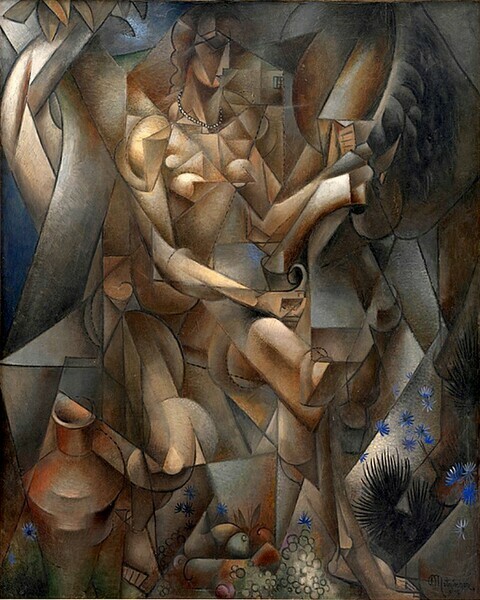
Jean Metzinger, 1911-12, La Femme au Cheval (Woman with a Horse)
'And then it happened.
He had never felt this outside of the Zone, and even in the Zone it had only happened two or three times. Suddenly, he seemed to be in another world. A million smells assaulted him at once - smells that were sharp, sweet, metallic; dangerous, caressing, disturbing; as immense as houses, as tiny as dust particles, as rough as cobblestones, and as delicate and intricate as watch gears. The air turned hard, it appeared to have surfaces, corners, edges, as if space had been filled with huge course spheres, polished pyramids, and gigantic prickly crystals, and he was forced to make his way through all this, as if in a dream, pushing through a dark antique shop full of ancient misshapen furniture.....This only lasted a moment. He opened his eyes and everything disappeared..This wasn't another world - it was his same old world turning an unfamiliar side toward him, revealing it for an instant, then immediately sealing it off, even before he had a chance to investigate.'
Red Schuhart, a 'Stalker', Roadside Picnic, by brothers Arkady and Boris Strugatsky
Red Schuhart seems to be having an extra-dimensional experience in the above quote, and the vision seems much like that of a Cubist painting or drawing.
The fantastic thing about stories, about narratives, is that they can contain information as well as just being entertaining. Roadside Picnic has an enormous amount of metaphors and allegorical informational qualities to take note of; the whole story and aspects of it can allude to, and be transferred to, other subjects. My first reference to the book in a post below was thinking of the mysterious and incomprehensible alien artifacts found in the Zone similarly to art, which when at it's best seems to me to be mysterious and incomprehensible. In the quote above, where Schuhart seems to see space unfold like paper revealing novel dimensional surfaces and intricacies, I see a link to Cubism, 'hyperobjects', or 'hyperobjectivity'. I think of Cubism as an attempt at hyperobjective projections and perception; it wasn't just a style, it was a relatively formal analysis of objects and the space surrounding them from multiple viewpoints, often as objects move or oscillate in space. I like the use of the word hyperobject for form viewed from various locations, viewpoints, perspectives, in space. Or, for forms moving through space so that their aspect or viewpoint changes infinitely from a fixed position. Or, for forms in which the delineation between the object and the surrounding space becomes ambiguous. This seems to be what is happening to Schuhart's vision in 'Picnic'; he seems to be describing a momentary Cubist vision of the world in which occult aspects form and dimensionality appear to override his standard perceptual model of objects in space. It's analogous to a drug induced hallucination as dimensional revelation from an altered mental viewpoint. Schuhart could be describing a Cubist painting; compare his description in words to the visual style of the image of Metzinger's La Femme au Cheval above.
Anyone who has put in the thousands of hours to learn how to draw has spent time not just describing form, but looking at it intently and, at a subconscious level, studying it's peculiar nature... as well as the peculiarities of our perception of the stuff that the world appears to be made of. Anyone who has spent hours beginning to learn how to draw (in the classes I used to instruct anyway) learned how to accurately measure angles and proportions of their subject on an imaginary 'projection' beside their easel and transfer the information from the projection 'beside' their easel and onto their paper. As angles are measured, the construction lines sketched vector off into the surrounding negative space. The initial working drawing executed in this formal manner, a measured planar drawing often looks very 'Cubist'. It takes very little imagination to take the chiseled planes that describe the form and project them off into space and reciprocally have negative space invade the form through these channels. I suspect this very analytical kind of 'constructed' and measured drawing might have informed Cubism; indeed early Cubism was called Analytical Cubism, a clue that it wasn't just a stylistic flourish but a measured and dimensionally extended way of seeing the world.
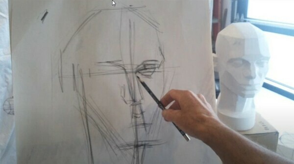
First steps in a constructed drawing from a 'Planes Of The Head' can often have a Cubist appearance.
But there are certainly other fairly obvious precipitating factors that helped establish the Cubist vision, and indeed the vision of the society of the time. Photography for example. In the years and decades prior to Cubism's inception photography emerged into the visual domain and stop motion photos and multiple exposures revealed how form traveled through space adding a distinctive new dimension to visuality; time and locational multiplicity. Practically this allowed, for example, the discovery of how horses run. Our narrow visual perception in time doesn't allow us to comprehend the rapid movement of a horses legs and the placement of their feet when they gallop; prior to the camera horses running were ridiculously depicted as though rabbits hopping. This was not the fault of the human artist, but rather the limitations of human perception. Photography; stop motion photography, allowed more than a glimpse into another dimension, and effected the vision and perception of artists of the time and therefore the imagery they produced.
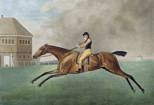
A painting by the artist, anatomist and observer of all things equine, George Stubbs, shows how hopeless it is was for even an informed observant anatomical expert trapped in a narrow perception of time to try and depict a galloping horse.
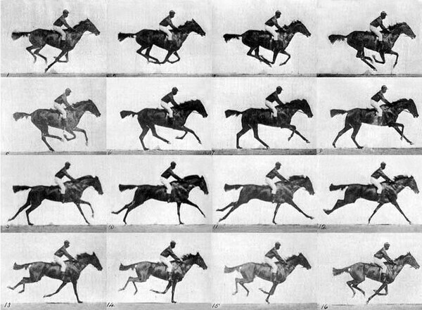
With the advent of photography with fast shutter speeds stop stop motion and time, Edweard Muybridge was able to solve 'The Galloping Horse Problem'.
There can be little doubt that Cubism was precipitated in part by trying to suggest an extra-dimensionality. Think of Marcel Duchamp's Nude Descending a Staircase; Duchamp is almost certainly depicting various imagined planes on a figure constructed similarly to a planar drawing as they both move and project through space as the figure/object/form descends a staircase. This creates a fascinating, wonderful, dizzying effect, also not unlike Schuhart's brief vision of the world.
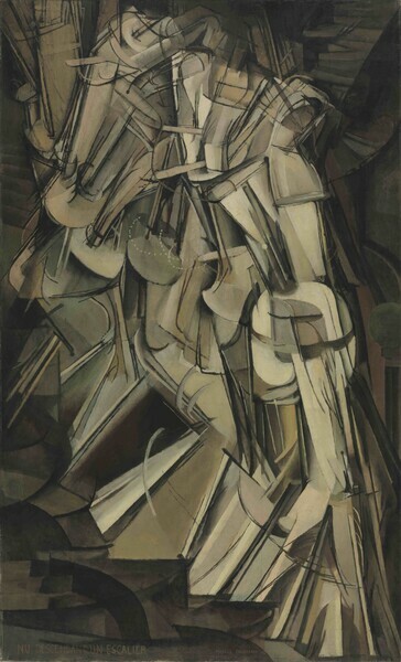
Duchamp's Nude Descending a Staircase; structural planes moving through space.
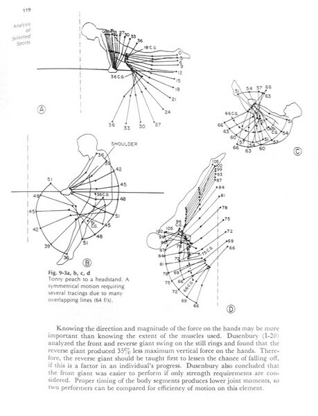
For comparison to 'Nude Descending'; diagramatic illustrations of human movement plotted in space from 'Patterns Of Human Motion, a cinematographic analysis, ' by Stanley Plagenhoef, 1971. These were produced by scientific researchers decades after Nude Descending.
There were other ideas in the realm of physics during this time challenging the nature of matter, of substance, of the stuff we and our world is made up, the stuff artists spend vast amounts of time drawing and staring intently at. Physicists were starting to challenge the meat and potatoes structure of Newtonian physics. They were starting to discover, through theoretical, mathematical and experimental processes, an astonishing vision of how the universe is working outside the scale of human existence and perception...not dissimilar to how photography revealed a horses legs and hooves moving outside human scales of time and vision when galloping. However, if the movements of a horse became comprehensible when the stopping of motion was applied to imagery via photography, in science things were weirder. The bigger things got and the smaller they got the more unusual and unhinged from the mechanics of Newtonian Physics and human scales of perceptioin they became.
For a complex understanding of early 20th century thinking it might help to imagine arts and sciences, and no doubt other, streams of understanding (psychoanalysis, experimentation with mind altering drugs, for example) forming a confluence which had manifestations in the visual arts.
Back to La Femme au Cheval. Neils Bohr, the physicist who discovered the principle of complimentarity in quantum theory bought the painting, after previous ownership by a poet and a collector, and installed it in his office. Bohrs had allegedly read the book 'Du Cubisme' which outlined Cubist principles, of which Metzinger was an author and was inspired to realize that objects, such as atoms, appear quite different when viewed from different vantage points; for example appearing as either a wave or a particle. And stranger still, observation of the object was discovered to alter it's qualities. The perception of matter effected it, and as in Cubism was altered by vantage points; it might be here or there; it might occupy space or not. I have no idea of how quantum theory works, or if anyone can really comprehend it, but, through the darkest of glasses darkly, I envision objects unfolding and folding or curling and overlapping with time and space in dimensions inconceivable at the human scale. I see quantum effects, through imagination, rendering the form and matter we daily take for granted and transforming it into something that by analogue looks something like a Cubist painting; something akin to Red Schuhart's vision.
La Femme au Cheval in quantum physicist Neils Bohr's study.
What I find so extremely interesting here is that an analogous understanding of objects, space and dimensions can emerge simultaneously among people who are skilled at observational drawing, artists, and people who are skilled at mathematics and physics. Both seem to have contributed to an new understanding of observed objects. Both are, in their respective ways, describing form and space. For me it shows that valuable knowledge can be obtained not just by academic study but by developing visual skills like drawing.
This anecdote isn't the only example I've discovered that suggests that skills based visual artists were and are capable of contributing to scientific understanding of the world and how it's perceived; I'll put up other posts showing how I think artists might have made and used discoveries early in the 20th century that weren't subsequently discovered and documented by research psychologists until decades later.
In a contemporary art world where I believe drawing, the describing of form, has been devalued to mere 'mark making', I find great solace in these early and significant contributions of skilled artists to the human body of knowledge.
Ch-Ch-Changes
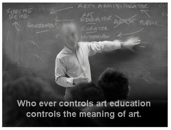
When I began my training to be a visual artist in 1976 the art world appeared a very different place than it is now. The difference is not in the appearance of visual art itself, in fact it could be argued that not much really novel, conceptually, has been created since the early 20th century. The difference seems in contemporary art's supporting ideologies; what viewers expect from it; it's societal and economic functions; what art now means to people, and especially those in 'the arts'. Few individuals seem to have noticed what I believe are radical changes, or have at least made the effort to comment on them, but in this post I feel compelled to offer some observations from the point of view of a working artist. Commentary and philosophy about the visual arts seems to have muted what actual working artists themselves think about art, and amplified what those in the domain of educated 'experts' and academics think about it. The defining of what is art seem to have shifted dramatically in the direct of those who know about art, from those who actually do it. I think the point of view of a working artist should be prominent in the overall comprehension of visual art and meaning of art, as I believe it once was.
There were periods over 40 years during which I personally didn't feel aware of change; I was too embedded and too preoccupied with making images for both fine and applied visual art. Developing and employing the (now dismissed as 'traditional') skills for the making of visual art and then applying them requires an enormous amount of both time and effort. It is, or was, a lifetime project and I couldn't easily see the forest for the trees. But I'd regularly come up for air and take a look at the topography of the visual arts in general and notice that massive changes were afoot. For example, my old art college was jockeying to become a degree granting institution and bring in white collar professional art academics and cut loose blue collar occupational artist-teachers. Only working artists my age might be able to make the necessary comparisons to what art was like...for an artist...to what it has become...for an artist. Younger people have only experienced recent time so experiential comparisons of what was and what now is are not possible, nor the noting of observable changes over the last 50 odd years.
So here's some observations; bear in mind they are conjectural for being anecdotal subjective experiences filtered through memory. But I don't think this subjectivity rules out their value.
-When I went to study art it was more about training. This is not to suggest there was no education in the process, but the most significant things you could learn was skills. In fact, by learning 'how to' do something you actually learn a lot 'about' it. If you just learn 'about' something you don't necessarily learn 'how to' do it, and are lacking insight into the actual process. This is the difference between theoretical knowledge and technical, or practical knowledge. This is a recurring concern of mine regarding drawing; there is a huge difference between knowing 'how to' draw and knowing 'about' drawing, and the latter is severely lacking. If you are studying drawing today, at a university, the first thing you might ask yourself is 'is your professor actually excellent at drawing' and if not what is the basis for their expertise and can you expect any enthusiasm for the subject from them?
-The flagship visual art institutions for study in Canada in 1976 were colleges, not universities and they were difficult to get into (I have been told about 300 successful applicants would be accepted by my college out of about 3,000). As well there were not a lot of major art colleges. People often went to universities to study art because they failed to get into a college or because they wanted to study art and receive a steady and relatively lucrative income as a high school art teacher. Some students would leave art college and go to university for academic studies in art and then, with their received degree, go to teachers college. I recall it being said at the time, quite cruelly in retrospect but with some degree of truth, 'those who can't, teach'.
-The art world seems to have been radically colonized by academia in the last 40 years or so. I would venture to say that academia holds an almost complete hegemony over the visual arts, particularly at the institutional level, in my community and country.
-Academia, universities, as an 'organism' or 'entity', don't recognize entities or individuals that aren't products of themselves. They are utterly blind or oblivious to capability, knowledge and skills gained from other locations in society, for example, the workplace ( I have worked for animated film directors who got a job painting animations cels after grade ten and continued working and moving both laterally and upwards in an 'animation factory', doing layout, storyboard, and design over periods of several years). Or, self study. Universities only acknowledge the fiat currency of credentials and are oblivious of commodity currencies such as skill. Increasingly over the years, as the arts technocracy (curators, arts administrators and instructors) has been filled by credentialed individuals, and the blindness to the achievements of those from outside the university system has increased. An obvious reason for this is, of course, is that by insisting on taking courses, programs and pursuing formal study universities make money and their employees receive relatively high rates of compensation. This system of operations for universities has almost certainly resulted in the 'educational inflation' in the visual arts.
-My instructors in the 70's were generally working artists, or had been. They might work as illustrators, costume designers at the opera, create displays at the museum or science center, and, in the Fine Arts Department where I studied, they would also be exhibiting regularly at commercial and public galleries. Most were teaching part time. The teaching, for working artists, was a relatively well paid gig that could make the difficult and fickle existence of being a working artist slightly more secure, as well as providing the satisfaction of passing on skills to a new generation of working artists. In fact, I returned to my art college to instruct drawing and painting for a period of about 5 years whilst exhibiting and working as an art director and background painter for animated films. It still seems sensible to me that occupational artists should teach artists. But things seem very different today. The visual arts now seem to be taught largely by a cadre of full time or aspiring-to-be full time 'regularized' or tenured professional 'art educators'. They are usually not full time working artists and have probably never tried to earn their crust as an artist; at best they do a bit of their own art on weekends or holidays and call it 'research'. This new model actually deprives actual working artists of potential supplementary income instructing, made worse by the fact that official government funded art programs are funded generously by governments.
Furthermore, if whoever teaches art to a new generation defines art for that new generation consider how the meaning of art might change when it is instructed by professional teachers and not working artists. I suspect this is one of the most salient mechanisms for a change in the understanding of visual art over the last 50 years.
-The 'New Model Artist', the sort of artist who most students probably aspire to be is someone who teaches art full time at a university and is ultimately, once tenured, paid a steady upper middle class salary. They do their art in their spare time similarly to how university professors publish in their spare time. Because of a secure teaching position and salary there is no obligation for their art to be a commodity. So it is easy for art educators to produce non marketable ephemeral art forms such as installations or projections. The institutional public gallery system, also colonized by academia, has fetishized this sort of conceptual art and, as I often notice in their literature, demean the notion of producing art that can be sold as a commodity. It has been my experience that art educators also tend to encourage not thinking of art as a commodity.
-Artists are criticized by the arts technocrats when trying to make a commodity out of the product of their labour...their visual art...but the same criticism is not to be leveled at those arts technocrats selling the products of their labour. It is quite all right for technocrats to make a commodity out of their professional services to the arts, their teaching at official government subsidized institutions, their arts administration in public galleries, and their curating. Why should the work of artists not be valued similarly to the work of arts technocrats? I believe this asymmetry is best thought of in terms of the labour movement; workers vs. management, where workers value is degraded and managements is upgraded.

-Some of the 'new' nomenclature in art clearly suggests how art has been defined in recent decades by 'professional' educators. Artists invariably now have a 'practice'...like a lawyer. There is a preoccupation with the word 'research', as with an academic or scientist. Contemporary artists are inter/multi/trans disciplinary; another academic shibboleth. Signalling an academic education is paramount in any contemporary artist statement; they 'hold' BFA's, and 'received' MFA's, which, due to educational inflation the latter has become an extremely expensive minimum requirement for any self respecting artist. I have been told my old art college, now a university, won't look at anything below a Phd in hiring an instructor.
-The academic emphasis in arts education has plunged the visual arts into the domain of words, to which images seem subservient. This has created a demand for the explicable at the expense of the inexplicable. If an artist (or student) cannot create an image that can be compressed into explicability then they are often considered to have failed. I have often detected in younger (than me) critics of visual art, or film, a sense of...almost outrage really...at not 'getting' what an image or a movie is about. It is almost as though they are being cheated. They fully expect to be able to explain, or have explained, what they have experienced and that their failure to do so is the fault of the artist or filmaker. People who view contemporary art are now, generally speaking, 'educated' in the verbal and written domains and they therefore have expectations that they should effortlessly receive verbal meaning from what they are viewing. It seems inconceivable that they should not understand an image. As someone from the 20th century I feel quite the opposite. I feel that the domain of images is irrational, surreal, and communicates to very different, non verbal areas of the brain. I don't expect to necessarily understand images at a logical, rational or conscious level (although of course I try to. Or rather that part of my brain does, but I try to avoid giving it complete control of my visual perceptions). I can happily walk away from a gallery or a cinema stimulated, perplexed, confused, or 'dumbstruck', but I find this is something that few people today can tolerate.
-Returning to credentialism; when I was a student the diploma I received, the piece of paper, after four years of art college, wasn't the most important take-away. What was important was demonstrated competency through a portfolio. Your 'bag' was everything. Highly competent drawing was still valued as tangible evidence of having taken the time to observe and describe form, something that was considered essential for a visual artist. Drawings might not be the be-all-and-end-all of a portfolio but they seemed essential to demonstrate visual competency. If we view the visual arts as an economy, decades ago the strongest currency was the 'commodity currency' of demonstrated competency. This now seems to have been replaced by a fiat currency of paper credentials. The fact that a dim view is today generally held of skill based commodity currencies such as drawing means it can be almost impossible to determine 'how good' someone is by looking at their work alone. I have heaped art images found online from high school students, undergraduate students and graduate students into files and mixed them up and looked intensely at them individually. In all honesty in most cases I cannot discern, by looking at skill levels, to what level of education an image belongs. Only when I read what is written about the image by it's creator do I realize the level of education achieved by the creator; this is demonstrated, of course, by what are essentially fashionable academic code words/signals written in an obtuse post modern style that escalates according to achieved level of university education.
-There have never been so many people calling themselves artists per square kilometer in human history. Not just the astonishing numbers of people recruited by institutions to go to university to study visual art (and this is truly a huge difference between the past and present) but all the millions of people with no training, no ability, no idea, who suddenly become self declared artists, perhaps for example, when they retire. This is sort of the NeoDuchampian wet dream we live in. Everything is art. Everyone is an artist. But if everything is art then surely, realistically, nothing is art. This is the underlying nihilistic subtext to this way of thinking; antiart.
-The flow of value in the visual arts now seems to be primarily away from artists. The arts are no longer a model where, primarily, artists produce art which is consumed by others. Artists now spend vast sums of money obtaining an education (money that goes to art educators and the institutions that employ them), and then continue to spend considerable sums of money paying for materials, for studios, paying to exhibit online or in galleries, join galleries and organizations, and purchase arts services. Juried exhibitions are an astonishing example of this; they have become a business model for fundraising by fleecing artists in the vague/vain hope of exhibiting and receiving 'exposure'. You pay to play, and in return get only the hope that your art will be included in the juried exhibition. The model is really no better than a lottery. Working artists have been reduced to consumers at best and gamblers at worst. It seems it is artists themselves who primarily fund and float and drive the arts economy; it is not artists who benefit from the fundamental economic structure of art as an industry. It has been my experience that it is largely artists, bless them, who buy other artists work.
-It seems to me there was a time when visual culture was in large part defined by artists themselves. Not completely, of course; academics, aesthetes, collectors and critics all had their input. However, artists had a profound role in the definition of what visual art was because they used to be valued and their opinions respected. In the past culture transpired far more significantly from those who produced the artifacts, the arts was more of a 'bottom up' process, more authentic, more 'self propelled', and the non artist contributors role seemed in large part to describe or facilitate what was taking place on the ground more than trying to wrest control of it. There seems to have been a significant change in this respect over my lifetime. Artists don't seem to be having much of a say in defining art anymore; that has become the purvue of the professional art educators, the curators and arts journalists. If you view the visual arts as an intellectual economy it is now a kind of Soviet supply side economy that is steered by bureaucrats. Artists themselves are mere interchangeable fodder, Proletariat, in the contemporary regime. Observing how my local public gallery operates confirms this hunch.
-In the past, skilled artists made art. Now, anyone is allegedly capable of it. In our local public gallery, people apparently come off the street and are 'engaged' in 'make art' projects. Anyone can make art! So...who needs artists? This engagement is often described as a kind of accessibilty issue, a democratization of the arts, that everyone is open to the 'opportunity' to make art regardless of visual training or aptitude. All attempts at art are somehow equal. But why are accessibility and equality demanded for the making of art when it isn't for the curating of art, or the teaching of art, at universities for example? Teachers and professors work behind formidable gate-keeping institutions, unions and professional organizations and consider their professions exclusive. How would we feel about anyone off the street flying airliners or performing brain surgery? Why shouldn't visual artists be entitled to some kind of exclusivity as I believe they had in the past?
Formidable Forms
Another element of art I used to enjoy introducing to students of drawing, painting or design was form. Form was my favorite because I like drawing and drawing is fundamentally describing form. Shapes are 2D forms. As usual I would try and show how the elements of art work at a visceral and emotive level, consciously or unconsciously. I wanted to show how powerful, suggestive, and manipulative of perception shapes and forms can be. And I wanted a bit of a Voight-Kampft style presentation to provoke human (not replicant) responses. Here is some of the stuff I used to like to show and talk about.
Having worked in animation as a background painter and art director I had taken notice of the form of characters, both 'good' and 'bad'. There are particular qualities to their design depending on their 'alignment'. For example, I worked on a direct-to-video sequel to Beauty And The Beast. Weird story. Sort of a cartoon manifestation of The Stockholm Syndrome or a bad marriage. The male holding a woman hostage is a beast but she fervently believes 'I'll change him...' Regardless, here's the prince in his more palatable form.
Notice his large eyes and flat face. He's exhibiting traits of a juvenile primate or mammal, despite apparently being a mature adult capable of reproduction. These childhood, or paedomorphic traits, when retained in a mature specimen, are called neoteny. Compared to other primates and apes, humans generally exhibit neotenous traits. Humans might retain these traits for various reasons. Perhaps curious and flexible childhood brains come with the neoteny package. Perhaps because humans have evolved to work together in groups the neotenous traits might make individuals easier to collaborate with. Neoteny is also a condition that domesticated mammals exhibit through breeding. Their behavior is less 'wild'. Perhaps humans are more 'domesticated' compared to other primates. It has been speculated that there has been increasing sexual selection for neoteny, as in 'cuteness', during human mating. Males in general might seek younger 'cuter' females as sexual partners as they might be more fertile, pushing the species as a whole toward neoteny. In B&B Belle herself is without doubt 'cute' and neotenous, and the same might be said for the Prince, above. But compare the prince after he has transmografied into 'The Beast'...
...Proportionally smaller eyes, pronounced chin, receding forehead. Obviously he's less domesticated, more animal-like ('wild"), even ignoring the sharp gnashers and plush fur. He now exhibits traits of form associated with gerontomorphism (also called peromorphism). These traits are the opposite of neoteny. Take a look at the two chimps below; on the left an adult and on the right a 'child'. Notice the difference in form. We respond far more positively to the neotenous juvenile on the right because it is 'cute'. Flat face, big eyes and bulging cranium. Immature mammals aren't just cute, they are curious, engaging and affectionate. We have a strong positive emotional response to their form and instinctively want to pick them up and perhaps even nurture them. This is probably a visceral, emotive and mammalian evolutionary response to perceived infant forms. A warm positive response from a subject to an immature mammalian form would suggest they are not replicants and capable of reacting emotively and humanly to an element of art; form. With onset of adulthood chimps, like the one on the left become gerontomorphic, as well as more aggressive and dangerous. We correspondingly respond more cautiously, even with some alarm, to wild looking gerononmorphic forms.
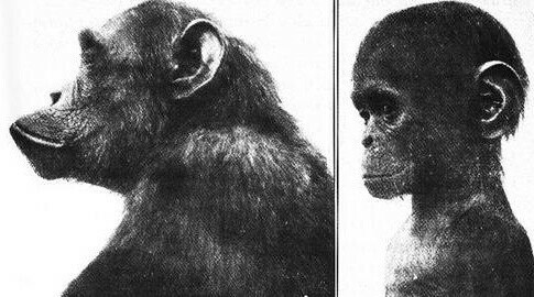
Below is a human baby, exhibiting 'cute' paedomorphic traits; if these traits existed in adulthood they would be neotenous. Likewise with the 'cute' cat in the photo below the baby. Can you sense that you are responding similarly to the two images?
Below are a couple of adult fox photos I found online. The top photo is a wild red fox. The bottom photo is allegedly a domesticated, probably Russian Siberian fox. The Soviets bred domesticated Siberian foxes, that is, they selected them for neotenous traits of being more tame, docile and less 'wild', in order to farm them for their fur. Unfortunately the white coats became mottled with dark spots; in fur bearing mammals this (often) black and white or mottled colouring is indicative of domestication and made the fur less desirable; it didn't match the wild specimens. Domesticated dogs, cows, and horses exhibit similar patching on their fur; Dalmation dogs, in black and white, are a striking example of this. Livestock are of course domesticated in order to become more docile and manageable and also exhibit the mottled fur colouration. Pets are bred to be tame, docile and affectionate, but also to look 'cute', which involves big eyes, flat faces, and floppy ears. This is a casual observation, but it seems that dogs with longer snouts and more gerontomorphic features do seem more aggressive, as in Dobermans. Notice the structure and form of the heads of the wild and domesticated foxes below.
Directly below is a classic gerontomorphic human head. Compare to the adult chimp. The traits associated with the form of wicked witches are exactly the kind of traits that I noticed would be exhibited in 'bad characters' in the animations I worked on, and also in the animated film and television I watched to stimulate my own on-the-job background painting treatments. It is as though if you want to make a character 'bad' you give them these traits. Gerontomorphic traits are often projected on to racial groups, for example Jewish people; depictions of Shylock in The Merchant of Venice are/were often designed to fit this 'bad character' appearance. Arab 'Evil Viziers' in cartoons also demonstrated the same approach to form.
Here's some more animated villains all showing gerontomorphic traits in the form of their heads...
The casting and/or make-up of live action characters often projects the same features onto villains.
There is a real downside to all of this. We can't help the way we look, we're born into our features. Or age into them. Someone with the misfortune of having more gerontomorphic features probably won't be treated as well as people with 'cute' features. Think about how cute and attractive school children might be treated by teachers with more consideration and affection than 'unattractive' children, and how they may well go on to do better in life as a result.
One last note on the effect of villainous characters whose form signifies bad alignment; often evil doers are also given scars and disfigurement, as if it somehow suggests a disfigurement of their personality. Again, as with 'unattractive' qualities, this is really quite a cruel treatment for those who have had the misfortune of being disfigured. But it speaks volumes to our psychic makeup that art repeatedly uses these forms to provoke an emotional response. Shakespeare gave Richard III a hunch back and withered arm although in fact his discovered remains show he just had scoliosis.
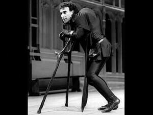
There are some interesting exceptions where authors and filmmakers play with the notion of gerontomorphy. Perhaps Beauty and the Beast, is one (although I still think it's more suggestive of The Stockholm Syndrome) in that Belle might be seeing through the physical form of the beast to the more Beautific soul of the young prince.
In Studio Gibli/Hayao Miyazaki's Howl's Moving Castle animated film the 'good' protagonist is a young girl with a spell cast on her which turns her into a very dear and determined old lady with gerontomorphic features, turning the tables on villain stereotyping.
Miyazaki also played with the notion of disfigurement in Porco Rosso, the Red PIg, an animated aviator who is kind-hearted but rough around the edges and looks like a pig. Perhaps his physical form is an allegory of his being a burn victim in an earlier plane crash.
I should wrap this up just with the observations on the human head, but in class I'd often include some other examples of the power, and significance, of form as an element of art. Some of these I'll cover again in a post on biomorphic shapes, but consider what cellular and multicellular life forms consist of; enclosures, erections and sphincters.
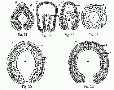
I'd personally recognize these forms and the 'engineering' of life in much of the biomorphic abstract art of the 20th century. I'd also see them in architecture; perhaps the womb like enclosure of St. Peter's in Rome with the cervix like colonnade of Bernini out front that might draw in the devoted like sperm cells. Or, better still, at ground zero in Toronto, the Doom Stadium, and enormous womb-like enclosure with a sphincter-like retractable roof cheek and jowl with what was at one time the worlds biggest free standing erection. Womb, cock and cunt.
Paul Arden, working for Saatchi and Saatchi created an astonishing series of adverts for the cigarette called Silk Cut which turned it into the best selling brand for women. There can be little doubt as to what the this image of a 'slit' in fabric below alludes to; a silk cunt. However, we apparently pay so little conscious attention to advertising images few of us notice how they affect us at a subconscious and visceral level. This lack of attention is probably what makes advertising work so effectively in manipulating our consumer choices.
Below is a clever poster for Lars Von Trier's film. These are powerful and suggestive visual forms whether we are actually aware of what they suggest or not. ()
To indicate how valuable forms are to a brand, I'd often show automobiles. Some would be high end and some low end. But it is often the shape of a car, a Jag, a Merc, a Cadillac, a Rolls, or the shape and design of some specific component of them, like the grill, that defines the brand. Grills on family cars are often passive, 'smiling' and pleasant but in sportier models, or trucks, often snarling and aggressive. This old VW ad, which I remember seeing regularly as a teen in magazines, makes a nice comparison to the film poster above. This ad alludes to the power and propriety of a shape and therefore appear to describe form, as in a drawing.
You should know the shape of the Citreon, if you're of a certain age. Often regarded as one of the finer auto designs. It is often used in the advertising of other products for the design prestige associated with the form. But look closely in the ad below; there is a motif that is a 2D form, a series of shapes which, if you're Canadian, should suggest something you are quite familiar with.
That would be the CBC logo. The forms in the Stella beer ad with the Citreon were too close for comfort, so CBC apparently sued and the ads were withdrawn. As well as the Voight-Kampff-like effects on the human psyche, or perhaps because of them, forms have high proprietary value and can be copyrighted. Think Coke bottles. To me, this is a further indication of how powerful form, as an element of art, is.
Colour My World
Few would doubt the visceral effects of colour and it was easy, when instructing, to use a sequence of images with vivid colour, an element of art, that would register an emotional human response much like a Voight-Kampff test. Sanguine livid red was an ideal choice.

From Kubrick's The Shining
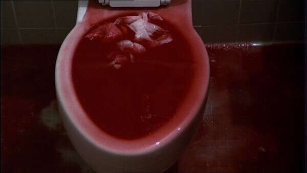
From Coppola's The Conversation
From De Palma's Carrie
Red seems to be one of the most provocative of colours if you present it in the right way. People can tend to 'oooh' and 'aaaah' over bright colours in a painting that have literally been just squeezed from a tube, an act requiring little or no discernment or ability.
Colour, strait out of the tube, is an easy way to get attention, and I'm always a bit suspicious that artists who use bright chromatically pure primary colours are hitting a lowest common denominator. I love Van Gogh's drawings and spent many many happy hours poring over them as an art student. I'm not so keen on his paintings. I might be wrong to be unmoved by his painting: I often told students that I like a lot of bad art and dislike a lot of good art for completely subjective and personal reasons. However, I could argue that it's the bright colours and a hundred years of public relations that have cemented Van Gogh's position in the art historical canon.
Use of colour can be nuanced and complex, particularly in decoration and decorative art. I certainly took colour seriously when younger and painting for a living. But decoration wasn't generally what I had in mind when I thought of the kind of art I'm drawn to, hence my bias against 'decorative', pretty or overtly pleasing pictures. I was often obliged to use livid and primary and secondary colours in animation work. But generally I've been more interested in what is inside of the colour wheel, all the taupes and cool greys effected by colour. These are the dirty colours that emerge from mixing primary and complimentary colour. These are wonderful colours to model form with.
In the extreme through, as a result of my love of drawing, I'm even more interested in the absence of colour. I see a red door and I want it painted black.
Komar and Melamid are a couple of Soviet-era emigres to the US who did a survey which would allow them to patch together 'The Most Wanted Painting'. They asked for favorite genre, subject matter and contents, and which colours were preferred. The end results were fairly similar in various countries; in the US landscape was preferred with averaged out proportions of sky, land, water, grassland, trees, high ground, and lowlands, animals and a historical figure.
Do bear in mind that really, the whole project is almost certainly a conceptual joke and isn't really meant to be taken very seriously. The idea of crunching data on taste into a representative painting can be done but the results are absurd. It's quite possible that Komar and Melamid are mocking art, surveys, not to mention ordinary people and their tastes. Here are the survey results for favorite colours.
Blue: 44%
Green: 12%
Red: 11%
Black: 4%
Purple/Violet: 4%
Brown: 3%
Pink/rose: 3%
Beige/Tan: 2%
White: 2%
Grey: 2%
Yellow: 2%
Mauve: 2%
Fushia: 2%
Maroon: 2%
Let's go back to 'seeing red', because it's such a provocative colour and can provide us with a powerful example of the impact of colour as an element of art, particularly when designed to do so, by nature or by humans. Red in nature and in human social life might be a way of signalling. Although a red stop sign or fire engine can signal danger, and certainly catches the eye, often red seems to be used for signalling for reproductive purposes.
Find the opening portal for The World's Most Wanted Painting HERE.
Red catches the eye of insects and hummingbirds seeking nectar in a feeding/fertilizing relationship between flora and fauna.
Above, Georgia O'Keef's paintings of flowers (and mimics of them) often appear like female sexual organs and O'Keef often deploys red.
Below, lipstick catches the attention and turns the mouth into something lividly sphincter-like which is generally considered an exciting form of sexual signalling.
In some species of primate females display anogenital tumescence during estrus, which is likely a kind of signaling of sexual fertility and receptivity for males. Reds, or pinks, seems the signalling colour. There's something of an analogue in the art historical record where artists wish to bring attention to sexuality.
male and female figures by Louise Bourgeois
 \
\
A couple of figurative works by Egon Schiele using colour to accentuate sexuality
In introducing the elements of art, and colour as an element of art to students, I was trying to elicit a strong emotional response and not simply provide an inventory of dried goods. The response might be disgust, repulsion or or pleasure, desire or anything in between including amusement. I think art, certainly art from the era I was imprinted in, was often designed to provoke. Of course my provocative approach to the elements of art might not be for everyone, but no single approach can be, and to the best of my knowledge no one was mortally offended or psychically damaged. And if they were they were perhaps they discovered they might be better suited to studying interior decoration and not visual art.
One final note on colour and the colour red. Not surprisingly red, or redness is often the colour cited by philosophers of mind as an example of the sensation of something. As in experiencing red. Or heat, or cold, or pain, or the fragrance of a rose. The sensation of the way things seem, the instance of how red is experienced by us in body and mind, has a name; qualia (singular quale). There's a lot of disagreement among philosophers, neuroscientists and psychologists about just what qualia are and even if they exist. If qualia exist they are intrinsic, private and experiential. But they are also ineffable and this makes the notion of them hard to pin down. This problem of definition perhaps isn't very different from consciousness, and possibly related. You know, or at least believe you are conscious, and you also believe you experience qualia as part of consciousness. But do you really? Perhaps it's most significant that we believe we do, we believe we are embodied minds experiencing reality.
Below is one of my own prints which I called 'Qualia'. Don't think for a moment I was trying to illustrate the notion of qualia; I do NOT want to make illustrations. I don't like the notion of art illustrating ideas, even though I think art is full of ideas. It's why generally I don't like conceptual art. Conceptual or illustrative, I believe that art that tries to explain something becomes narrower. Titles can be a problem in this respect. I'm usually forced to give images titles for identification purposes; often I would provide a completely misleading title although sometimes I would have trouble identifying the image in my mind's eye when the title was misleading. But qualia was straight up what came to mind when I applied the blodge of red, by hand and brush, on the print surface to fill a vacuum of space that seemed to require filling. I think that all the figurative drawings I made, whether quickly sketched life drawings or considered images tried to convey a sense of what it means to inhabit a body and experience the body in the world through the senses. I think most figurative artists are often trying to convey this, and when something in an image successfully strikes a chord in the viewer it is perhaps more successful than not.
Below another print with visceral figures and hints of red.
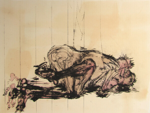
below another print in which I use some red tinting to try and increase, perhaps, 'tingly' sensation and embodiment.
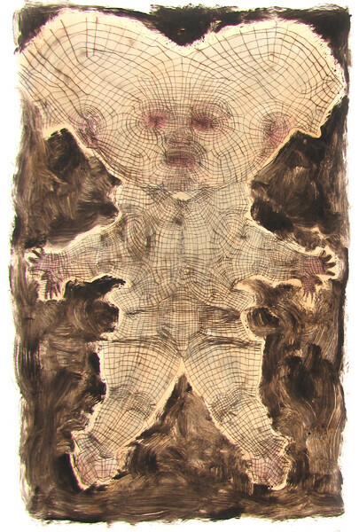
Below another print with a bit of colour, but not red this time. I find the combination of black and yellow alarming. It's often a motif on warning signs. Perhaps this comes from the colouring of some stinging insects and the evolutionary effect on our psyche. I find wasps alarming, like most people. They make an alarming, and perverse and interesting subject for a drawing. The colour juxtapositions heighten my senses and don't put me to sleep like more decorative colouring might.
I'll wrap up this blog post with one more of my prints. Again, these images just happen, there might be vague foundational notions, but in no way do I intend to illustrate. Meanings are usually found retrospectively. Obviously this is something abstractly wound-like on a landscape of sorts, and that was generally all I cared to know about it. It occurred to me to use red, which might make the sphincter-like form more wound-like, but red-red isn't actually very vibrant or a pure hue; it's not a pure red as in the magenta used in commercial print processes (along with cyan, yellow and black). So I used something close to magenta. I once spent a lot of time looking at punk rock LP covers and black and white xeroxed posters on telephone poles and these were usually a lot of black and white accented with livid magenta-pink so this might also have effected my choice of colour in this print for the purpose of highlighting. The colour was right out of the tube...
Extra Texture
This post is another installment in a short series on the elements of art, taken from some of my classroom instruction, in which I would try and show how the elements of art exhibit the power to provoke emotional responses. The elements of art might often be deployed subtly and with nuance but I wanted to provoke strong trigger responses to visual cues, much like the oral Voight-Kampff test as used in the movie Bladerunner. In the movie test a flat or indifferent response to what are usually emotionally provocative situations for humans indicates that the subject isn't human but rather a replicant. In class I simply wanted to show how how emotionally humans/students might respond to elements of art. Texture was quite straightforward with projections like this:
Showing the slide above, not surprisingly, always provoked a response ranging from mere disgust, to repulsion and, occasionally, genuine fear. For people who have trypophobia, a fear of multiple holes or bumps, this image triggers a most extreme response.
Trypophobia has only recently been recognized as a phobia, and there are questions as to how real and how manufactured it is. It seems to be a phobia that has a cult following largely from fans of the horror genre, which is interesting in it's own sense, because there are social media groups, members of whom are allegedly trypophobic, who deliberately gross themselves out. There is an aesthetic around the discomfort precipitated by the aversion, in the same way there is an aesthetic to gore in horror movies. In a way, these kinds of cultishness might be similar to the cult of inflicting and being inflicted with pain, as in sadomasochism. I find tryphobia an interesting manifestation of an element of art in that it has a strong sensual aesthetic following that actually shares of artfully created disturbing imagery.
Those who express tryphobic disgust/repulsion/fear are likely to have discomfort looking at strawberries or honey comb or wasp's nests or coral.
Apparently it's hard to know what 'causes' a strong trypophic response in people. It might be a evolutionary based fear of the contents of the holes which might contain pathogenic or pain inflicting organisms, they might suggest disease or bites, or it might just be something to do with the frequency and size of the holes. If evolutionary, many fear and startle responses might be useful for survival under certain circumstances; fear of heights, fear of snakes, fear of shadows in the dark. Why not fear of holes? Regardless of why we respond as we do to the texture of many holes, I thoroughly enjoyed attempting to make the case that yet another element of art can provoke a strong visceral response.
Bumps are apparently part of the trypophobic spectrum and although I'm not so much repulsed as intrigued by holes or bumps (unlike heights and confinement) like most people I definitely respond to them. As a child I found Daleks disturbing and mesmerizing for a number of reasons, but one was the alarming regular arrangements of convex semii-orbs on their lower exterior cladding.
Of course, not all texture has to be a panic inducing aversion trigger, but it can provide a profound sensual element to be deployed in visual art, both fine and applied, and it would not take long for anyone to find stimulating examples that are attractive or repulsive in the art or film making they enjoy. Think of how artists often go to great lengths to elaborately render hair, feathers or wood grains in their art.
Meret Oppenheim's Object, 1936